The Dashboard Designer provides the capability to create calculated fields that allow you to apply complex expressions to query fields. You can use these new fields in data visualizations the same ways as the regular query fields.
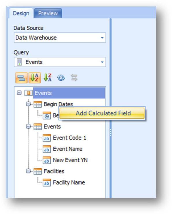
To create a calculated field, right-click the Field List and select Add Calculated Field in the context menu.
This invokes the Expression Editor dialog, which allows you to specify an expression that will be used to obtain calculated field values. Here, you can construct the required expression.
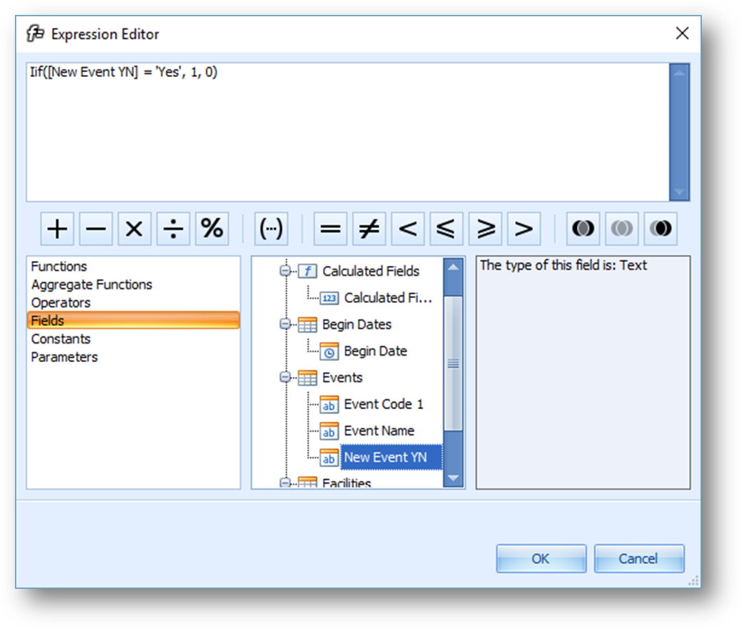
Expressions are built from the following types of elements:
•Scalar Functions (just labeled as Functions), which apply to each row of the query results.
o Date-Time (ex: DateDiffYear, which finds the difference in years between two date values)
o Logical (ex: Iff, which evaluates a comparison and then returns one value if it is true or a different value if it is false)
o Math (ex: Abs, which returns the absolute value of a number)
o String (ex: Trim, which removes blank spaces from before and after a text value)
•Aggregate functions, which apply to all the rows of the query results.
o Aggr – a unique function that allows for intermediate aggregations, explained later in this section
o Count – the number of values in the results. Null values do not increase the count.
o Count Distinct – the number of distinct values in the results. Duplicate values do not increase the count.
o Max – the largest value in the results, either numerically or alphabetically
o Min – the smallest value in the results, either numerically or alphabetically
o Sum – the sum of all values in the results
o Average – the average of all values in the results
o StdDev – the estimated standard deviation of a population, with the assumption that the included values cover only a sample of a larger population
o StdDevP – the standard deviation of a population, with the assumption that the included values cover the entire population
o Var – the statistical variance of a population, with the assumption that the included values cover only a sample of the larger population
o VarP – the statistical variance of a population, with the assumption that the included values cover the entire population
•Operators (such as comparisons > and <)
•Fields (references to the fields in the query result)
•Constants, including the special terms True, False, and the question mark (?), which matches “null” references.
•Parameters (references to the parameters defined for the dashboard, if any)
After the expression has been specified, click OK. This displays a new calculated field in the data source structure.
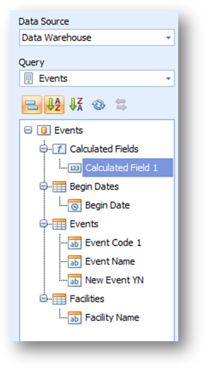
To give the calculated field a friendly name, right-click on it and select Rename. The right-click menu also includes options for editing the expression, specifying a field type for the output of the calculated field, and deleting the calculated field.
Intermediate Aggregations
The Aggr function allows you to introduce an intermediate detail level that is not related to the visualization level. This allows you to create custom aggregations at different levels and combine these aggregations with existing visualizations.
To understand what the Aggr function does, consider the scope of a single data point in any visualization’s output. The scope is the set of rows in the underlying query represented by the single data point. The structure of the layout and the choice of data items create a filter for the scope of each data point. The Aggr function lets you change the filter, and thus the scope, of any data point based on a calculated field that uses it.
The Aggr function has the following syntax:
Aggr(Summary Expression, Dimension1, …, DimensionN)
The summary expression must apply an aggregate function to a data source field. There must be at least one dimension listed after the summary expression.
The scope of data point based on the Aggr function will be filtered only by the specified dimensions and no others. If the visualization design does not include a filter for the specified dimensions, the scope will be unfiltered and the summary expression will be calculated on the full set of query results.
The following example may help explain how the Aggr function can enhance your dashboards. First, consider a basic grid showing dues year, contribution type, and the sum of contributions:

Now consider the following calculated field definition that uses the Aggr function and which I will call Total Giving by Year and Type:
Aggr(Sum([Contribution Amount]), [Dues Year Name], [Contribution Type])
Adding this column to the right of the grid produces this result:
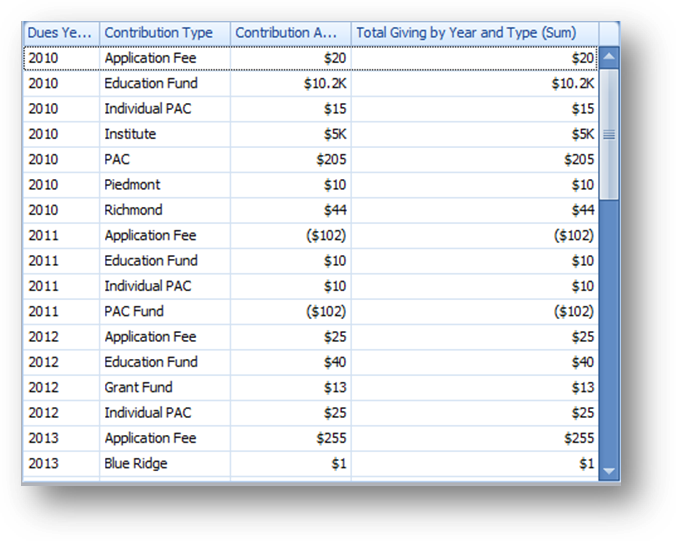
If you compare the numbers, you will see that the original contribution sum and the new sum are exactly the same. This is because the scope of the two values on each row is exactly the same: the rows that represent the contributions for a given dues year and a given contribution type. But watch what happens when an additional level of detail is added to the grid, subdividing the contributions by the chapter:
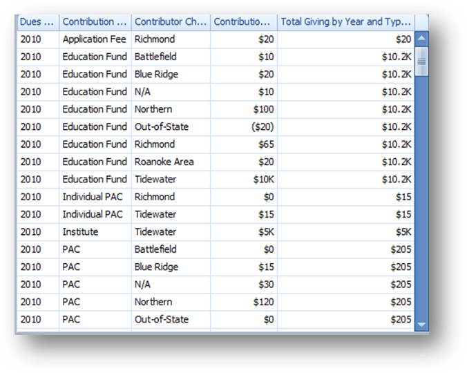
Suddenly the two columns are no longer the same. The scope of the rows for the basic contribution sum is now filtered by the contributor chapter, but the rows for the Aggr calculated column are not. They are still filtered only by dues year and contribution type. So every chapter row for the same year/type value is exactly the same, representing the sum of all giving for that year/type combination across all chapters. This is the purpose of the Aggr function.
Now consider the following change, removing both the chapter and the contribution type from the grid layout:
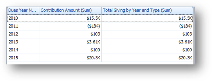
Once again the basic sum and the calculated column are the same because they both represent the sum of all contributions for a given dues year. The basic sum adds up all the amounts individually; the calculated column first calculates a subtotal of all contribution types before then summing the subtotals, but the end result is the same. However, if the final aggregation changes from SUM to another function, such as MAX, you can see the key difference:
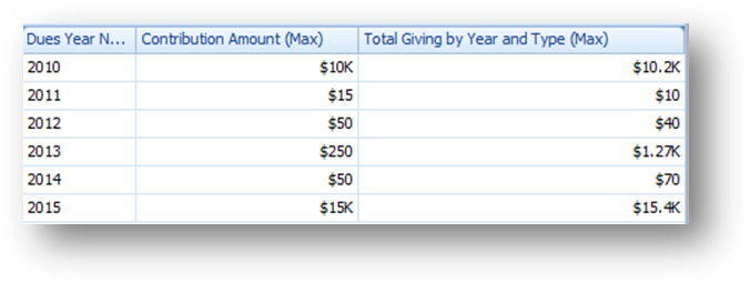
The basic column now shows the largest single contribution amount for the dues year. The calculated column shows the largest total amount given toward any single contribution type. (The sample data in the database used for this example contains many negative entries, causing the unusual results displayed in the screenshot above).