Purpose: To view events and related data. The events view allows you to select the date range of events to work with along with what fields are displayed. The information can be filtered, sorted and grouped to make it easier to see what you are looking for. Multiple views can be created for various scenarios. Information about the event along with registrations, fees, leaders, sessions and job cost are all available in event views.
Launch Point: The view can be launched from the following locations(s):
•Events à Views
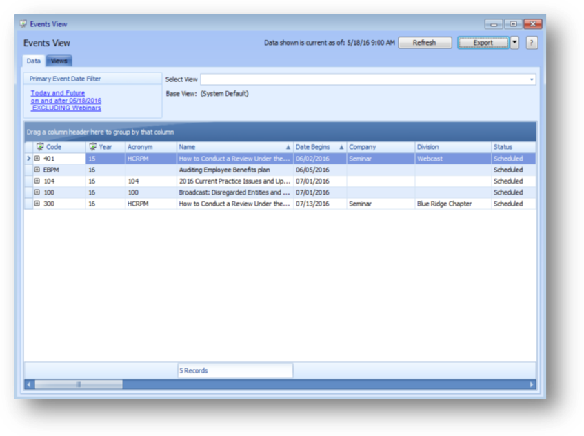
Example: When the view is launched a form will open
The default system view shows events from the current date forward and excludes webinars.
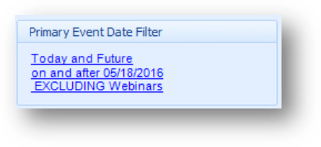
The Primary Event Date Filter shows the date range of events available to work with in the grid and if webinar events are excluded or included.
To change the date range of events that are available to work with, and/or the webinar setting, click on the link text.

This will open the Primary Event Date Filter window which allows you to change the date range of events available to work with in the grid and/or the webinar setting.
For the date range of events available to work with, you can enter a specific date range or select one of the relative date options. Note: This information is saved along with any other filtering set on the parent grid when you create a view.
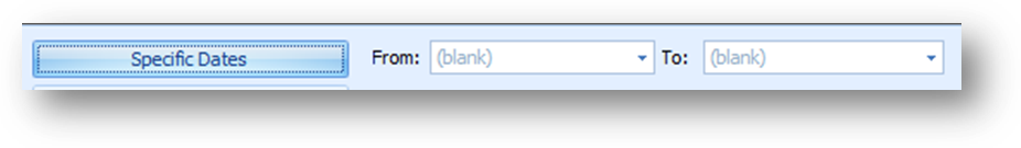
To select specific dates, click the Specific Dates button and enter the desired date range.
When specific dates are entered, every time you load the view, the same events are available to work within the grid. It doesn’t matter what the current date is, events that fall within the specified date range will be available.
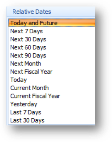
To select a relative date, select the relative date listing from the list.
When selecting a relative date, the events available to work within the grid, are relative to the date option selected.
Example: If you select the relative date of Current Month and save the view as “This Month Events”.
When the view is loaded on July 15th, events with a begin date of July 1st to July 30th will be available to work within the grid.
When the view is loaded on August 2nd, events with a begin date of August 1st to August 31st will be available to work within the grid.
Note: The relative date listings for fiscal year are relative to the current calendar date not what is set in the accounting calendar.
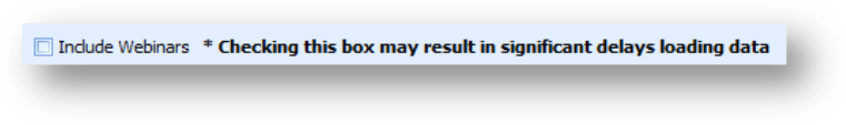
The Include Webinars check box is un-checked by default to exclude webinars. If you check the box to include webinars it may have a significant effect on the time it takes to load the data in the view.
Note: The webinar setting, like the event dates, affects what events are available to work with in the grid.
Note: An event is considered a webinar if the society has been setup to use the webinar vendor integration and the vendor, company and division on the event matches what is setup in the integration table for the webinar vendor(s). The integration table also denotes if the event is an internal or external webinar. The Include Webinars filter box only shows/hides external webinars. If your association does not use the webinar vendor integration and would like specified events to be considered webinars in the events view, contact CDS.
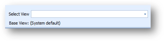
Use Select View to load a view. From the drop down list select the view to load.
Base View shows the last view loaded. The System Default view is loaded if you have not set another view as your default view. Note: When you save a view, Base View is updated to the name of the view just saved.
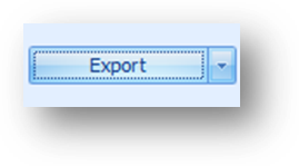
To export to excel click the down arrow on the Export button and select either Excel 2007 (.xlsx) or Excel 2000/2003/XP/2003 (.xls) from the list.
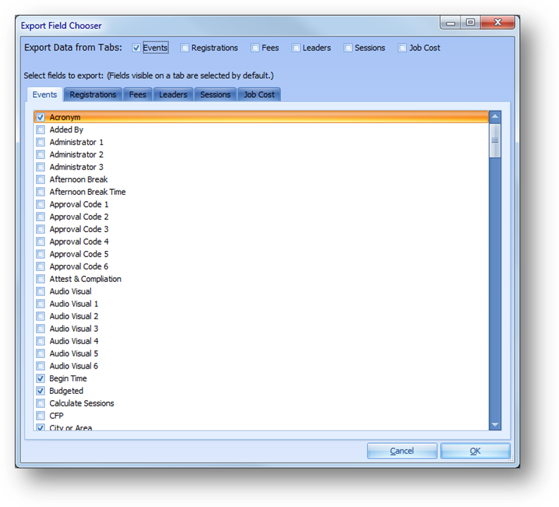
The Export Field Chooser window will open.
By default the Export Data from Tabs is checked for Events. Check/uncheck the boxes for the tabs you want to export data from. When a box is checked, the related tab below will be enabled.
By default the fields currently displayed in the grid will be checked for export. To not export any of those fields, uncheck the box by the field name. To add fields currently not displayed in the grid to the data exported, check the box by the field name.
Once all the desired tabs and fields have been selected, click OK to export the data. Each tabs data will be exported to a separate sheet in the spreadsheet.
In the Save As window select a location and enter a file name for the exported data. Then click Save. Note: The export can take several minutes depending on how many records, fields, and tabs are being exported.
Note: Conditional formatting does not show in the exported data.

The Help button, which has the question mark, will open documentation on the view.
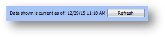
The Refresh button will refresh the data in the grid. When Events View is launched, or when a view is loaded from Select View, the grid is automatically refreshed to show current data.
The text to the left of the Refresh button shows when the data was last refreshed. Note: When the grid is refreshed the button will remain disabled for a short period of time. This is done to minimize repeated clicks to the Refresh button in a very short period of time which can cause connection errors.
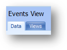
Events View is made up of two tabs. The Data tab is for working with the event data. The Views tab is for working with views you have created.
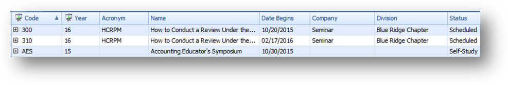
On the Data tab, the grid is grouped by event. The parent rows display information about the event.
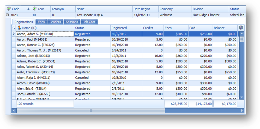
Click on the plus sign to the left of the parent row or double-click on the indicator cell for the parent row which is to the left of the grid row, to see the child tabs detailing additional information for the event.
There are child tabs for registrations, fees, leaders, sessions and job cost. Not all events, of course, will have information on all the child tabs. Only those with information for the related area will show records on the child tab.
The Registrations child tab shows information for registrants of the event.
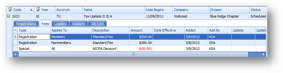
The Fees child tab shows fees on the event.
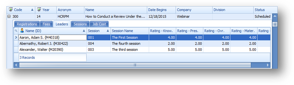
The Leaders child tab shows leaders assigned to the event.
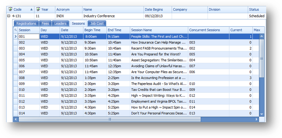
The Sessions child tab shows session information for the event.
Note: The Sessions child tab is the only child that allows for changes in the fields displayed.
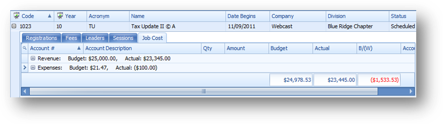
The Job Cost child tab shows revenue and expense information for the event.
Note: The Job Cost child tab is grouped on Account Type by default.

Click on the plus sign to the left of the group row or double-click on the indicator cell for the group row which is to the left of the row, to see the child rows detailing the revenue and expense information for the event.
What fields are shown in the grids and the order of the fields, left to right, can be changed. The sort order and grouping of the information can also be set.
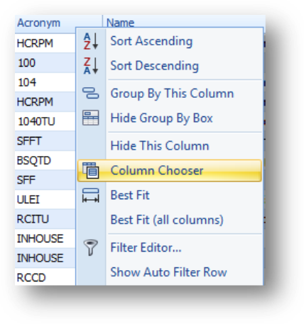
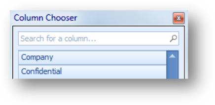
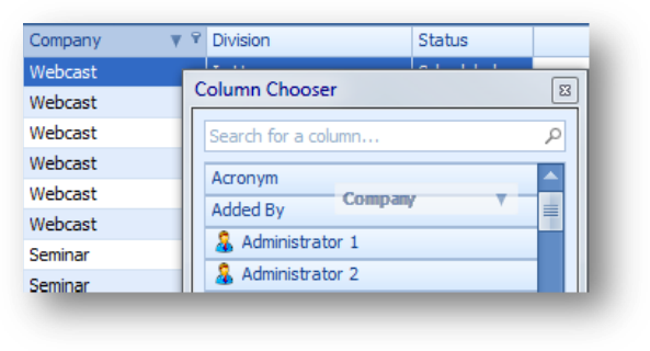
To add a field to a grid, right click anywhere on the header row to open the context menu and select Column Chooser.
Note: The Column Chooser is not available on the Registrations, Fees, Leaders, or Job Cost child tabs.
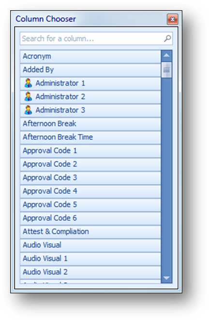
A window will open with a list of available fields, not already shown in that grid.
There are three ways to move a field from the list into the grid.
Note: When the Column Chooser window is the active window, typing the first letter of the field will scroll the list to show the first field that starts with the letter entered.
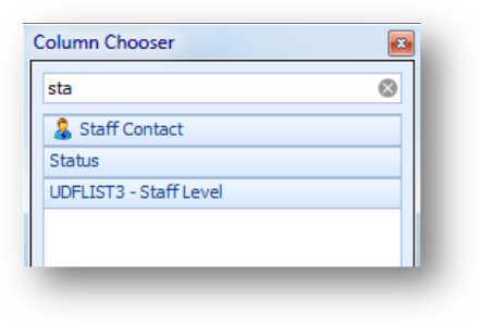
Note: The search field at the top of the window can be used to filter the fields displayed in the Column Chooser window.
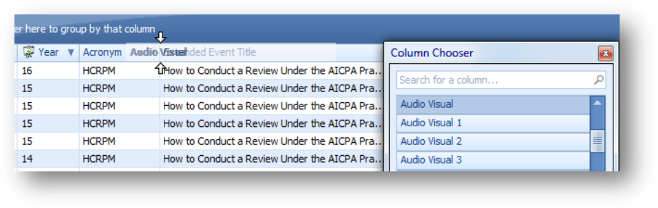
Drag and drop the field into the grid. Note: Do not release if ‘X’ is displayed.
When using drag and drop, the field can be placed in the desired location at the same time it is moved into the grid.
Double-click on the field in the list.
When adding a field this way you may need to then move the column to the desired location in the grid.
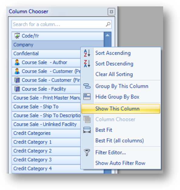
A field can also be added to the grid by right-clicking on the field in the Column Chooser window and selecting Show This Column.
When adding a field this way you may need to then move the column to the desired location in the grid.
Note: In some cases there are multiple fields that may hold similar information.
For example, in the parent grid there are 6 Audio Visual # fields (Audio Visual 1, Audio Visual 2, Audio Visual 3, Audio Visual 4, Audio Visual 5, and Audio Visual 6). Each of these fields relates to one of the Audio Visual fields on the Events Facility tab. Each field will display the information in the individual field. There is also an Audio Visual field that is a single field displaying a combination of the information in all 6 of the individual fields.
In addition to Audio Visual, these are the other fields that show combined information: Code/Yr, Credit Categories, Credits 1, Credits 2, Credits 3, Credits 4, Credits 5, Credits 6, Cur/Max (Wait), Related Event 1, Related Event 2, Related Event 3, Related Event 4, and Related Event 5.
For some of these combination fields, it will depend on what you want to do with the field that will determine if you would want the one combination field are all the individual fields. In some cases filtering on the combination field is not going to get you the result you desire. The filter may need to be set on the individual field(s).
There are three ways to remove a field from a grid.
Note: Removing a field is not available on the Registrations, Fees, Leaders, or Job Cost child tabs.
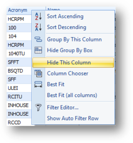
Right-click on the header row of the field to be removed to open the context menu, and select Hide This Column.
Another way to remove a field from a grid is to drag it out of the header row. Note: Do not release until ‘X’ is displayed, otherwise the field will not be removed.
A field can also be removed by dragging and dropping the field from the grid into the Column Chooser.
To change the order of the columns in a grid, click on the column header and drag it to the desired location.
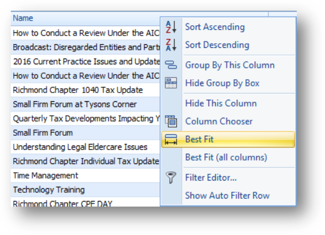
To make a column in the grid wider you can drag the right side of the column header to the right, double-click on the right edge of the column header, or right click on the header row of the field to open the context menu, and select Best Fit.
Note: To widen all the columns currently in the grid select Best Fit (all columns).
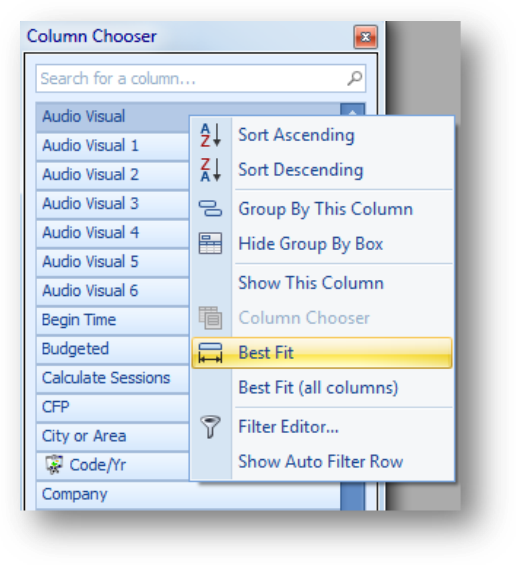
Prior to adding a field to the grid it’s width can also be set by right-clicking on the field in the Column Chooser window and selecting Best Fit.
There are two ways to sort the data in a grid.
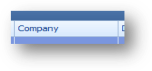
Click the column header of the column you want to sort by to sort ascending on that field.
Note: Click on the column header again to change to sort descending.
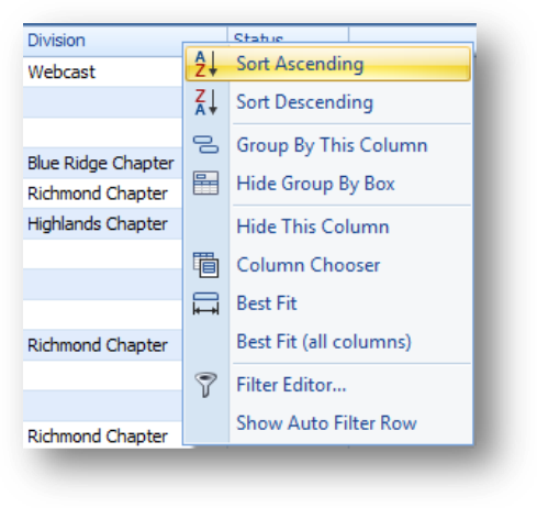
Or right click on the header row of the field to open the context menu, and select either Sort Ascending or Sort Descending. The information in that grid will be sorted based on the selected column’s values.
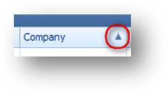
An arrow appears to reflect whether the sorted values are in ascending or descending order.
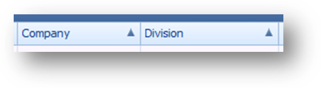
To add additional fields to the sort, either hold down the Shift key and click another column header, or open the context menu on another column and select one of the sort options. The information in that grid will then be sorted based on the first column and then the second column.
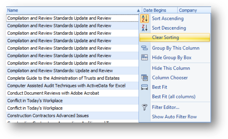
To clear the sorting from a column, right-click on the header row of the field to open the context menu, and select Clear Sorting.
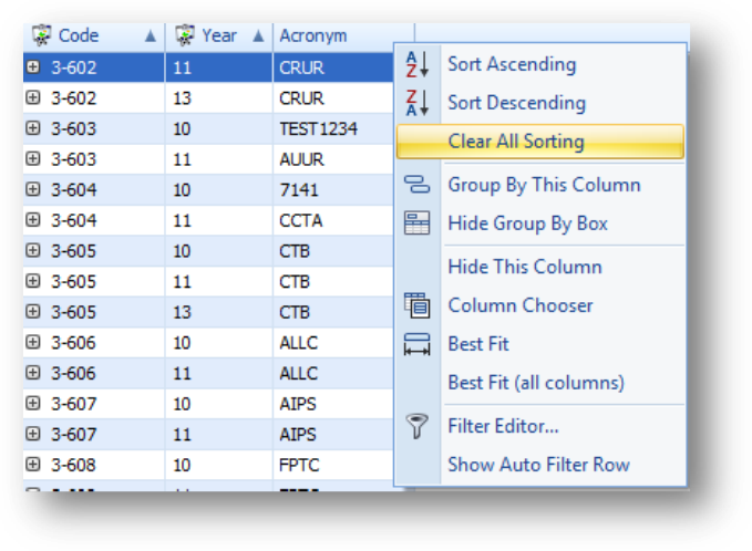
To clear sorting on all the columns in that grid, right click anywhere on the header row to open the context menu, and select Clear All Sorting.
Note: If there is only one field with sorting on it, Clear All Sorting is not available on the sort field.
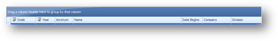
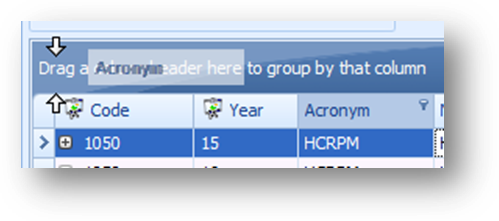
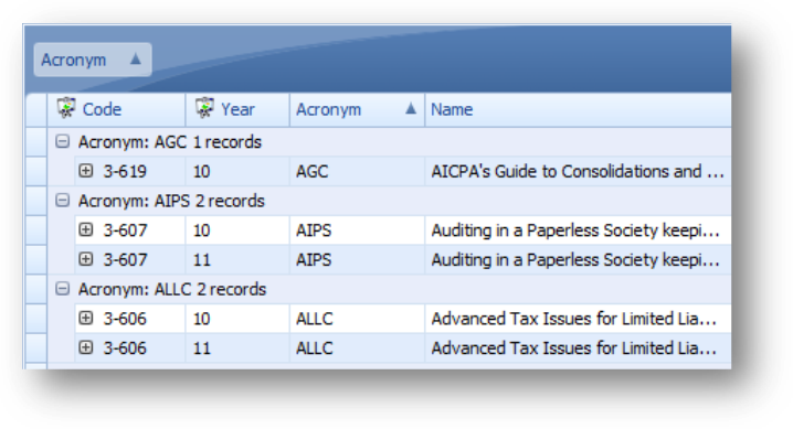
Above the parent grid, in the System Default view, is a group by box. This allows you to group the data displayed in the grid.
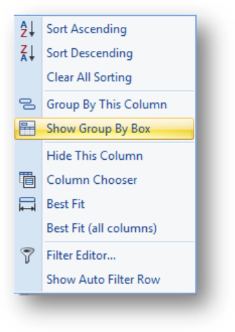
If the Group By Box is not visible, either right-click in the header row and select Show Group By Box.
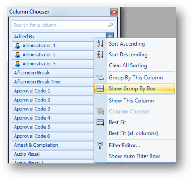
Or open Column Chooser and select Show Group By Box from the context menu.
Note: To hide the Group By Box, either right-click in the header row and select Hide Group By Box or open Column Chooser and select Hide Group By Box from the context menu.
To group the data in a grid by a column, either drag and drop the header for the field into the group by box.
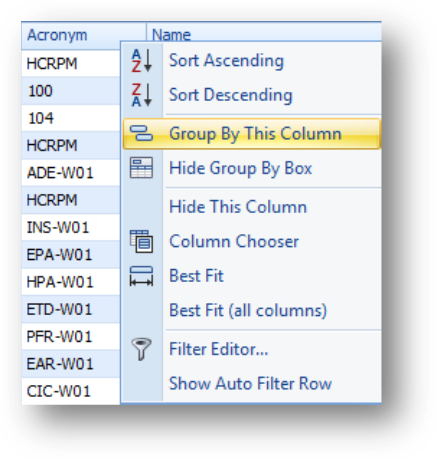
Or right-click on the header row of the field to group by and select Group By This Column from the context menu.
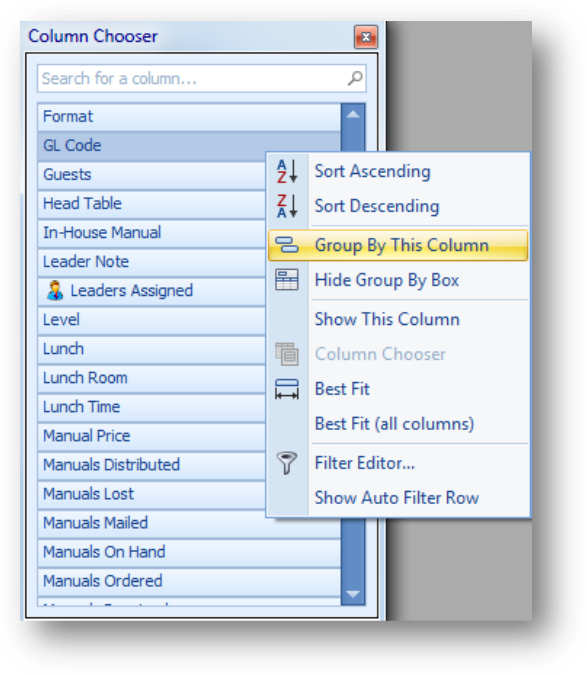
A grid can also be grouped on a field not in the grid. Either drag and drop the field from the Column Chooser window to the Group By Box or right-click on the field in the Column Chooser window and selecting Group By This Column.

The data will then be grouped by that field.
Note: The Job Cost child tab is grouped by Account Type by default.
When a grid is grouped, click on the plus sign to the left of the group row, double-click on the group row in the grid, or double-click on the indicator cell for the group row which is to the left of the grid row, to see the row(s) for that group.
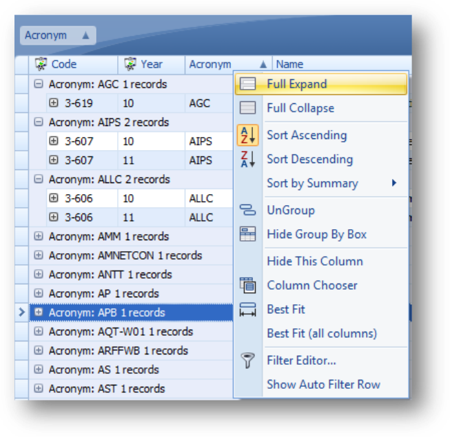
To see the rows for all groupings, either right-click on the field in the Group By Box or right-click in the header row on the field grouped on, and select Full Expand. To collapse all use Full Collapse.
There are four ways to ungroup on a field.
To ungroup on a field, and keep it in the grid, drag and drop the field from the Group By Box to the desired location in the header row of the grid.
To ungroup on a field, and remove it from the grid, drag and drop it out of the Group By Box.
Note: Do not release until ‘X’ is displayed, otherwise the field will not be removed.
Note: This is not available on the Registrations, Fees, Leaders, or Job Cost child tabs.
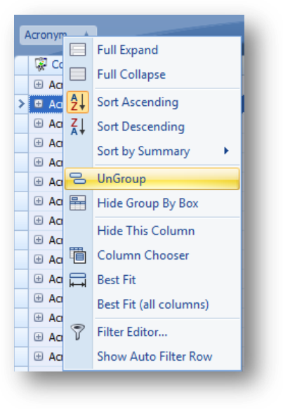
Also you can right-click on the field in the Group By Box and select UnGroup from the context menu.
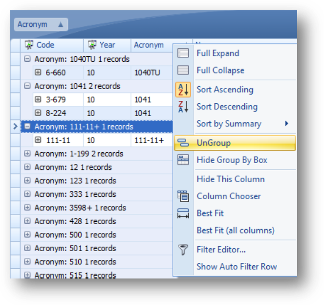
Another way is to right-click on the grouped by field in the header row and select UnGroup from the context menu.
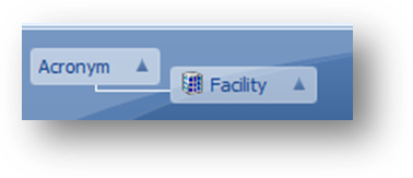
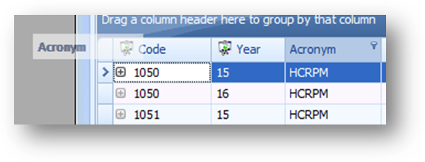
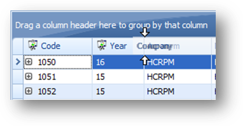
A grid can be grouped on multiple fields by adding multiple fields into the Group By Box. In this example the data is first grouped by acronym and then sub-grouped by facility.
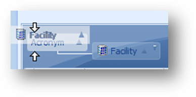
To change the group order, drag the field in the group by box to the desired location.
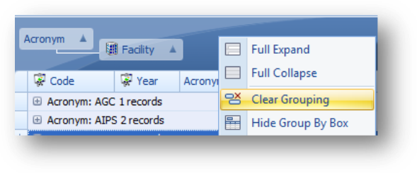
To remove all grouping, right-click anywhere in the Group By Box and select Clear Grouping from the context menu.
In addition to being able to set what fields are shown, their order (left to right) in a grid, the sort order, and grouping, filtering can also be added.
There are several tools for filtering the information displayed in the grids. Column Filtering, Auto Filter Row, and Filter Editor.
The various tools for adding filters all work together. So you can use a combination of the filtering tools to enter the filter criteria.
Column Filtering and Auto Filter Row are easy ways of filtering the records shown in the grid. For more advanced filtering, use Filter Editor.
Note: All three filtering tools are disabled for Date Begins. To change the date range of events that are available to work with, use the Primary Event Date Filter.
Note: Since, when using Column Filtering, only values available in the grid for the field are shown, when creating a view you may need to change the Primary Event Date Filter temporarily to have access to a value for setting the filter values.
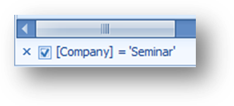
When a filter has been set, a filtering row is shown at the bottom of the tab where the filter is set. For the parent grid that is at the bottom of the Data tab. For each child tab it is at the bottom of the child tab.
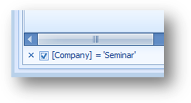
The current filter criteria is shown In the left of the filtering row.
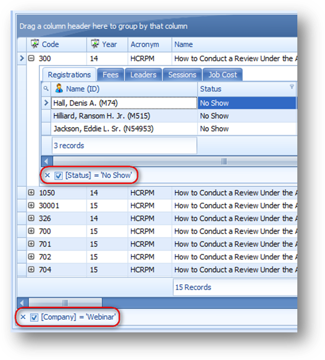
In the example above, the filter criteria on the parent grid is Company = Webinar and on the Registrations child tab, the filter criteria is Status = No Show.
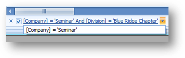
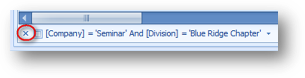
When the filter criteria is changed, previous filter criteria can be selected by clicking the down arrow to the right of the current filter criteria, or clicking on the filter criteria text.

To unapply the current filter criteria, uncheck the box to the left of the current criteria text.
To apply the filter again, check the box.
To clear all filtering on the tab click the ‘X’ in the filtering row.
This will both clear the current filtering on the tab and close the filtering row. The previous filter criteria history is not cleared. The next time you set a filter, the previous filter criteria will be shown again.
Note: The filtering is specific to the tab applied to, so if you have filtering set on multiple tabs will need to clear the filtering on each tab independently.
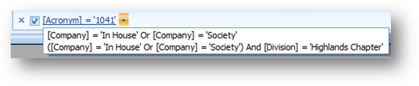
To remove a previous filter criteria from the list, first open the list of recent filters by clicking the down arrow to the right of the current filter criteria, or clicking on the filter criteria text.
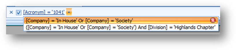
Then highlight the previous filter to be removed. When highlighted, a red circle with an ‘X’ is shown at the far right of the listing. Click the red circle to delete the previous filter from the list. Note: the current filter can’t be removed this way.
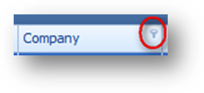
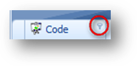
If a field can have Column Filtering applied, when you hover your mouse pointer over the field you will see a filter icon in the upper right corner.
Click on the filter icon and a filtering window will open.
The filtering window you see will depend on the type of field working with.
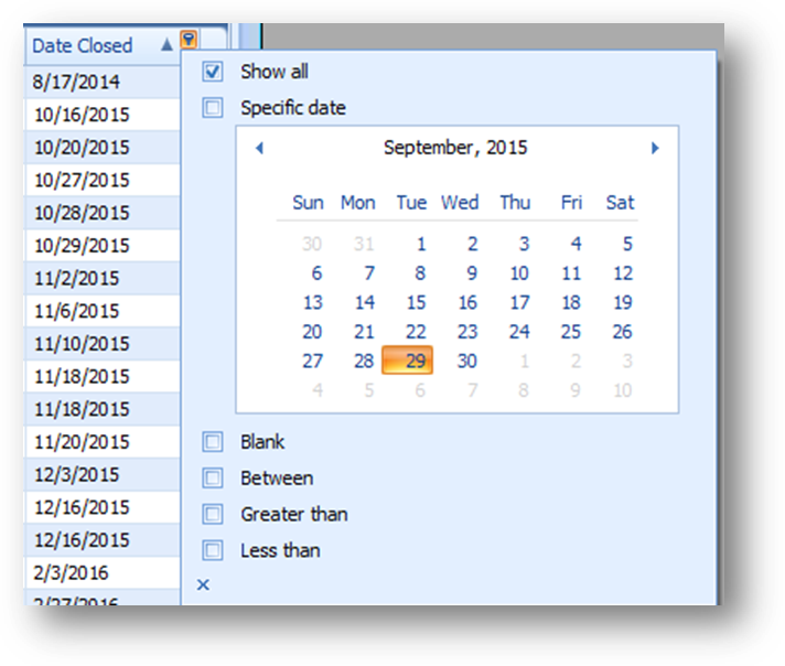
For date fields there are options for Show All, Specific Date, Blank, Between, Greater Than, and Less Than.

Hint: To move quickly to a different month or year, click on the label showing the month and year.

The calendar will change to show all 12 months for the year. To change month, click on the desired month.
Click on the label showing the year.
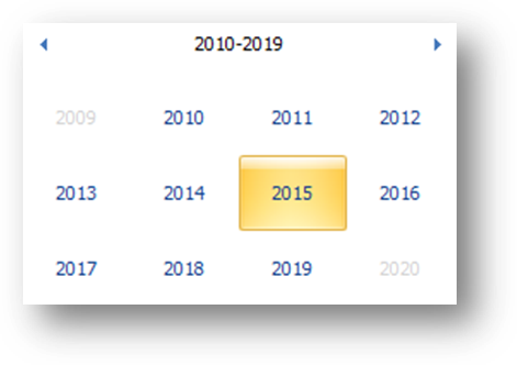
The calendar will change to show multiple years. To change the year, click on the desired year.
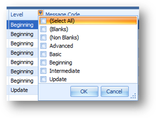
For all other fields a list of check boxes for unique values in the field for the selected date range along with Select All, Blanks, and Non Blanks will be shown.
Note: Blanks and Non Blanks will not be shown if the field does not allow blanks (ie.. Status).
Note: The Flag field will only have Select All, Blanks, and Non Blanks as available selections.
To filter for records that have a particular value, select the value from the list. If you check the box for multiple listings, records with any of the checked values will be shown.
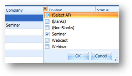
In the example above, “Seminar” was selected from the Column Filter drop down list on Company. This limits the records already displayed in the grid, to those which have a company of “Seminar”.
Note: When a filter is applied on a child tab, the filter is applied to that child tab for all parent rows.
When a Column Filter has been applied to a field the filter icon is shown on the header when not hovering your mouse over the header.
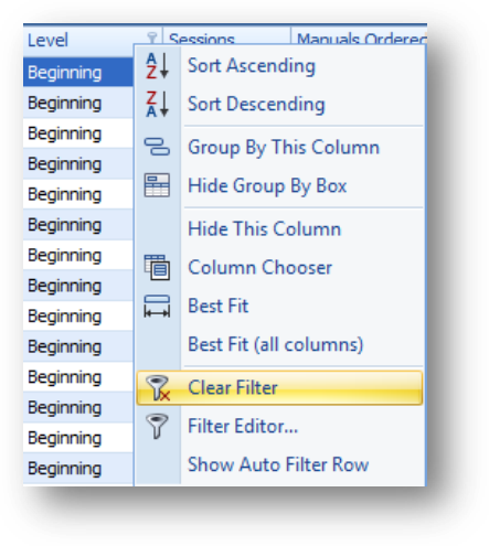
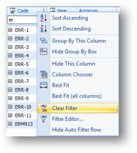
To remove the filtering on a specific field, right-click on the header row of the field to open the context menu, and select Clear Filter.
Note: Clear Filter is only available in the header context menu if there is a filter on the field launched on.
Hint: If you have filtering set on multiple fields and want to clear all filtering, instead of using Clear Filter on each field that has filtering set on it, you can close the filter row (‘X’ in the filtering row). Be aware that closing the filter row will clear filtering on all the fields on that tab and close the filtering row.
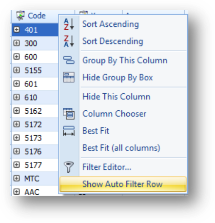
To add the Auto Filter Row, right-click on the header row to open the context menu and select Show Auto Filter Row.
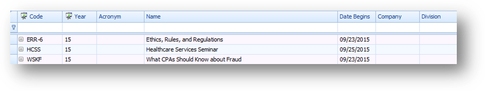
The Auto Filter Row, shown between the header row and the top record in the grid, allows you to filter on a field in the grid to show records where the text in the field ‘starts with’ the value entered.
Note: Fields that contain multiple listings, use ‘contains’ instead of ‘starts with’ as the filter criteria (ie..Fields of Study).
Note: To hide the row, select Hide Auto Filter Row from the context menu.
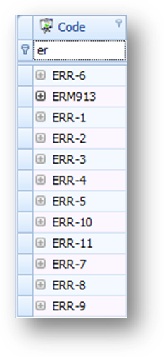
In the example above, entering “er” in the Auto Filter Row for Code, limits the records already displayed in the grid, to those with an event code that starts with “er”.
Note: When an Auto Filter Row filter has been applied on a field the filter icon is shown on the header when not hovering your mouse over the header.
To remove the filtering on a specific field, right-click on the header row of the field to open the context menu, and select Clear Filter. The filter can also be removed by deleting the text from the Auto Filter Row.
Note: Clear Filter is only shown in the header context menu if there is a filter on the field launched on.
Hint: If you have filtering set on multiple fields and want to clear all filtering, instead of using Clear Filter on each field that has filtering set on it, you can close the filter row (‘X’ in the filter row). Be aware that closing the filter row will clear filtering on all the parent fields and close the filter row.
For more advanced filtering use Filter Editor. There are three ways to launch Filter Editor.
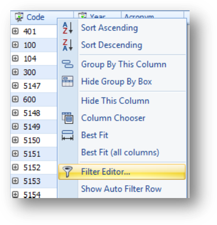
Right-click anywhere on the header row, to open the context menu, and select Filter Editor.
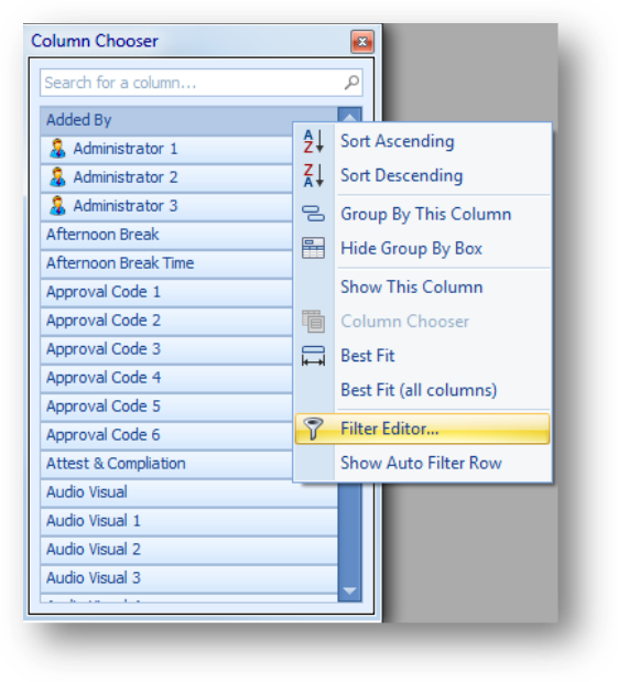
It can also be launched from the context menu in Column Chooser.
If there is an existing filter on the tab, it can also be launched by clicking Filter Editor in the right corner of the filtering row on that tab.
Remember that any filters already applied using the other filtering tools, Column Filter or Auto Filter Row, will be shown in Filter Editor.
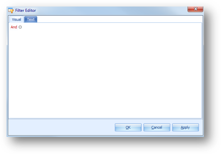
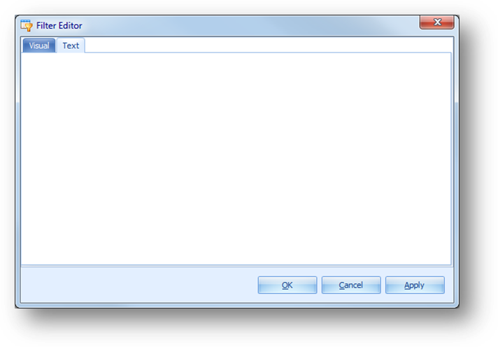
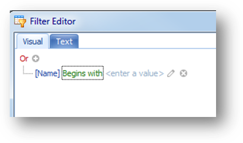
The Filter Editor window has two tabs, Visual and Text. By default the window is opened to the Visual tab.
Filter criteria can also be added, edited or deleted on the Text tab.
Hint: All filtering can be cleared by opening Filter Editor, clearing everything, and clicking Apply or OK.
When using Column Filter, OR is always entered between values selected in field and AND is always entered between fields with filters.
For example, if using Column Filter, two listings are selected for Company and two listings are selected for Division, the filter is company 1 OR company 2 AND division 1 OR division 2.
When using Auto Filter Row, the text entered for a field is always “Starts with” or “Contains”. Like with Column Filter, there is always an AND if working with multiple conditions.
In Filter Editor there is flexibility in where you put And/Or as well as having access to other comparison values.
Below are the basic functions when working on the Visual tab in Filter Editor.

To change the operator setting, click on the operator text to open the context menu. The options are And, Or, Not And, and Not Or.

To add a condition, click on the add condition button to the right of an operator.
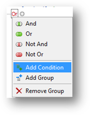
Or select Add Condition from the context menu.
A new condition line will be added to the group.
A condition is comprised of the field, comparison value, and compared value/field.

First set the field to work with. Click on the field text to open a list of available fields to work with.

Then set the comparison value. Click on the comparison text to open a list of available comparison values. The available values will vary depending on the type of field selected.
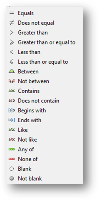
These are the comparison values for a text, link, or coded field.
Hint: When using a comparison value of Like or Not Like ‘_’ can be used to filter for any single character or ‘%’ to filter for any series of characters. For example if you are looking for an event code that has ‘4’ within it, select Is Like and enter a value of ‘%4%’. To find events where the 2nd character is ‘4’ enter a value of ‘_4%’.
Hint: When using a comparison value of Any of or None of an additional Insert icon (a circle with a plus sign) will be shown to the right of the comparison value. After setting the first value, use the insert icon to add a new item to the list in the condition.
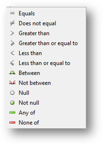
These are the comparison values for a numeric or check box field.
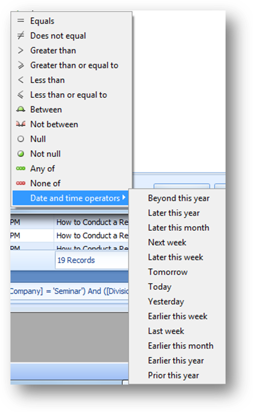
These are the comparison values for a date field.

Then set the compared value/field. Use the icon to the right of the value/field to switch between “enter a value” and “field”.

When the icon is a pencil, enter the text for comparison.
If the field is a link or coded field, in addition to being able to enter text, click the down arrow to see a list of available values to work with.
If the field is a check box when you click on “enter a value” a check box will be displayed.
When working with a date field, in addition to being able to enter text, click the down arrow to open a calendar control.

When the icon is a grid, click on the icon to see a list of available fields to work with.

To delete a condition click the delete icon at the right of the condition.
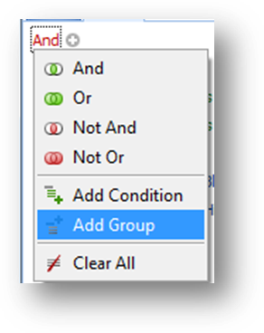
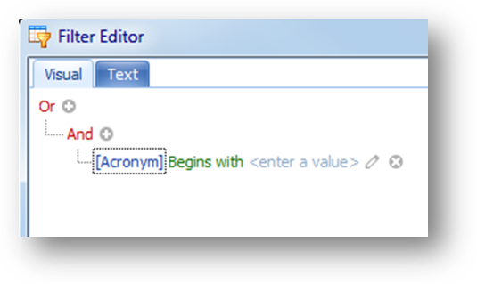
To add a group, click on the operator and select Add Group from the context menu.
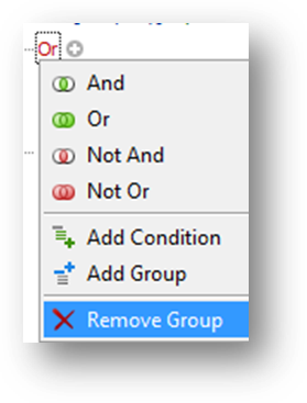
To remove a group, click on the operator for the group and select Remove Group from the context menu.
Note: Remove Group is not available in the context menu on the root (top) operator.
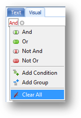
To clear everything in the Filter Editor, click on the root (top) operator, and select Clear All from the context menu.
Note: When adding filter criteria on the Visual tab it is best to map out the entire filter first including where the And/Or will be placed and the groupings needed. Some parts of the structure, once set, can’t be changed.
A filter group is a set of conditions combined by the same operator. The example below contains two groups combined by the OR operator.
Example: To look for events where Current is greater than 15 AND Company is Seminar OR Division is Highlands Chapter AND Vendor 1 is Surgent (03283).
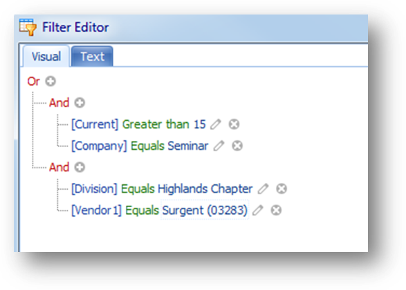
The filter on the Visual tab in Filter Editor would look like this.
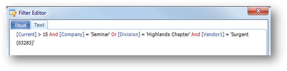
Hint: The Text tab can be useful in verifying that you have the filter setup correctly. As you build a filter on the Visual tab it is also shown on the Text tab.
Hint: On the Visual tab, the lines show which conditions are combined by the operator.

So in the example above, the line under AND which has branches going to the two conditions, shows that the two conditions are combined by that operator. Which for this group means that the conditions for Current and Company are combined by AND.

In this group the conditions for Division and Vendor 1 are combined by AND.

The line under OR, which has branches going to the two groups, shows that the two groups are combined by that operator. Which in this example, means the two groups are combined by OR.
This example consists of two groups, each with two conditions. The conditions in each group are combined by AND, while the two groups are combined by OR.
This is how to create this filter on the Visual tab in Filter Editor.
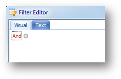
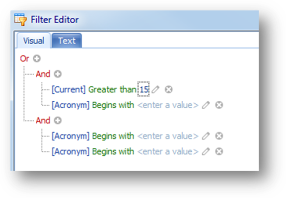
Start with nothing (may need to remove a condition).
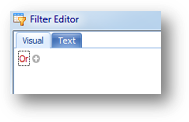
Click on the root (top) operator to open the context menu and select OR.
Click on the root (top) operator to open the context menu and select Add Group.
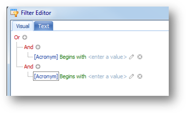
Click on the root (top) operator again to open the context menu and select Add Group.
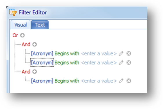
On the AND operator of the top group, add a second condition by either clicking to open the context menu and selecting Add Condition, or click on the circle with the plus to Add Condition.
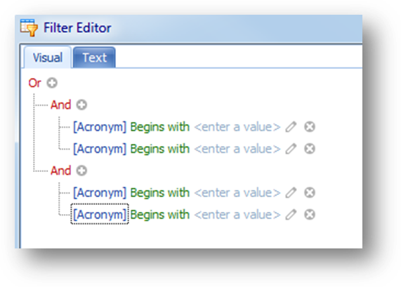
On the AND operator of the bottom group, add a second condition by either clicking to open the context menu and selecting Add Condition, or click on the circle with the plus to Add Condition.
That gives you the structure of the filter. Now set the fields to work with, comparisons and values.
Set the first condition in the top group, as field is Current, the comparison of Greater Than, and the value to 15.
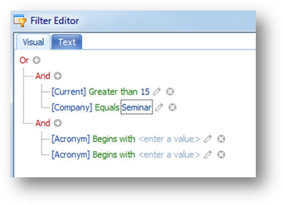
Set the second condition in the top group, as field is Company, the comparison of Equals, and the value to Seminar.
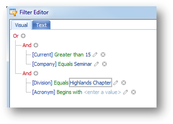
Set the first condition in the bottom group as, field is Division, the comparison of Equals, and the value to Highlands Chapter.

Set the second condition in the bottom group as, field is Vendor 1, the comparison of Equals, and the value to Surgent (03283).
Click Apply to apply the filter and leave the Filter Editor open, or click OK to apply and close the window.
Hint: When your filter includes looking for Value A OR Value B or Value C for one field, it will simplify the creation of the filter if you use one condition with Any of instead of multiple conditions, for the same field, each using Equals.
So if in your filter you want events where Company is Seminar OR Company is Conferences OR Company is Chapter Seminar.
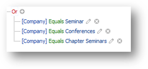
If you use Equals, three conditions would be required, all in their own group, with the OR operator.
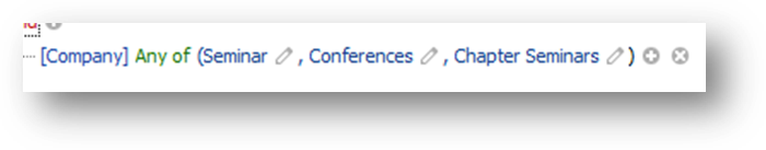
But using Any of, the condition would look like this. Only one condition is required.
Here is how to create the condition on the Visual tab in Filter Editor.

Set the field to Company and the comparison to Any of.
When using a comparison value of Any of or None of, an additional insert icon (a circle with a plus sign) is shown to the right of the comparison value.

Set the first value to Seminar. Then click on the insert icon to add a new item to the list in the condition.
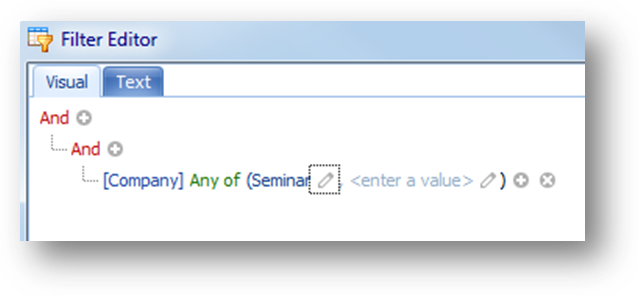
An additional field is added to the condition. Set the second value to Conferences. Then click on the insert icon to add a new item to the list in the condition and add the third value.
Changes made on the Data tab are NOT automatically saved.
To save the current settings on the Data tab, go to the Views tab.
Hint: Best to save a view if want to work with an event date range other than today and forward. It is beneficial to do this since the Primary Event Date Filter allows you to select relative dates. Instead of having to enter a date range each time, just select the appropriate relative date in the view and the system will handle adjusting the date range of events the next time you load the view.
In addition to being able to filter the information displayed in the grids you can also add conditional formatting by setting rules to the data shown in the grid.
Note: The conditional formatting functionality is provided by a third party and our ability to make changes to it’s function is limited.
Conditional formatting, which is handled in the rule manager, can be added to the parent and child grids.
Note: Each grid is controlled by a separate rule manager.
Note: When conditional formatting is applied on a child tab, the rule is applied to that child tab for all parent rows.
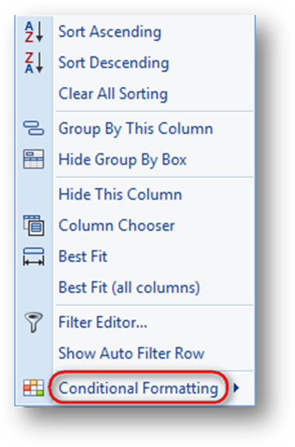
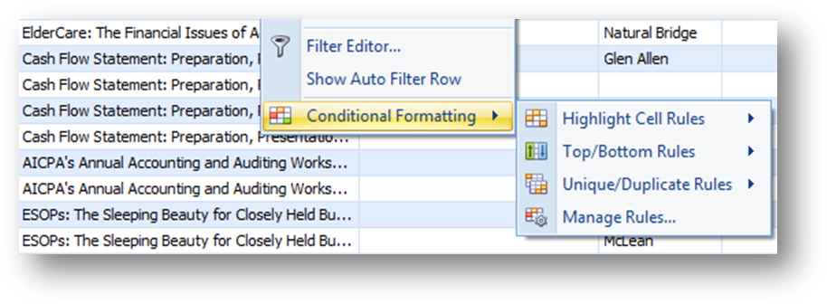
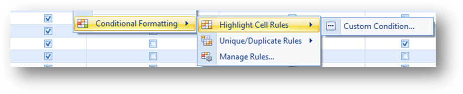
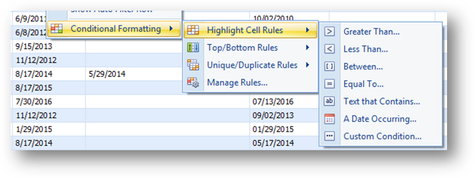
To add conditional formatting, right-click on the header row of the field to open the context menu, and select Conditional Formatting.
Note: By default the formatting will be show on the field lauched from. Once a rule is added the field to show the formatting on can be changed in Column of the Rules Manager screen.
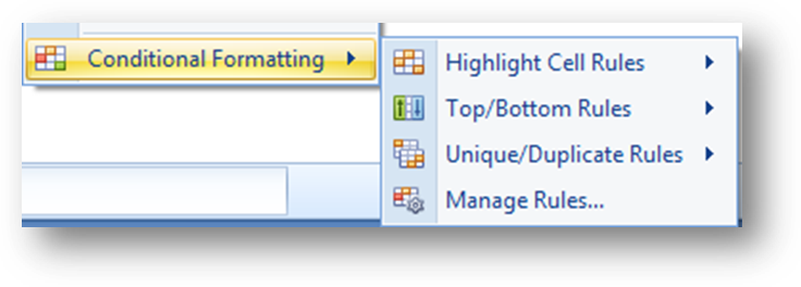
From the sub-menu, rules can be added either by using one of the shortcut rule options or selecting Manage Rules and using the rules manager.
Which shortcut options are available will vary depending on the type of field the context menu was launched on.
Note: The shortcut options only allow for adding a rule. Once added, to view or edit the settings for a rule, you must use Manage Rules to open the rules manager.
These are the rule shortcut options for a text, link, or coded field.
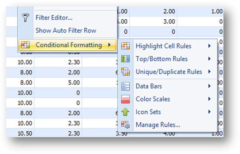
These are the rule shortcut options for a numeric field.
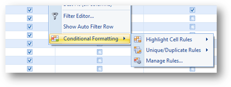
These are the rule shortcut options for a check box field.

These are the rule shortcut options for a date field.
Each shortcut option has a sub-menu of options.

These are the options for Highlight Cell Rules on a text, link, coded, or numeric field.
These are the options for Highlight Cell Rules on a check box field.
These are the options for Highlight Cell Rules on a date field.
Note: A different, or “short list”, of relative dates are shown when a rule is added from the Highlight Cell Rules shortcut A Date Occuring or Custom Condition as well as Use a formula to determine which cells to format in the rule manager. Everywhere else the list of relative dates shown, or “long list”, is shown. It is the values in the “long list” that are actually used anytime a rule is added.
That means that when a selection is made from the “short list” there may be a transalation made to the listing that best fits it in the “long list”.
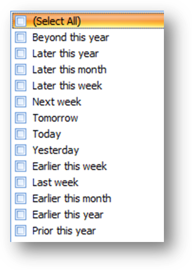
These are the relative date listing in the “short list”.
These are the relative date listing in the “long list”.
This is the translation used from the “short list” to the “long list”.
Beyond this year to Following this year
Later this year to This year, beyond this month
Later this month to This month, beyond next week
Later this week to This week, beyond tomorrow
Next week to Next Week
Tomorrow to Tomorrow
Today to Today
Yesterday to Yesterday
Earlier this week to This week, prior to yesterday
Last week to Last Week
Earlier this month to This month, prior to previous week
Earlier this year to This year, prior to this month
Prior this year to Prior to this year
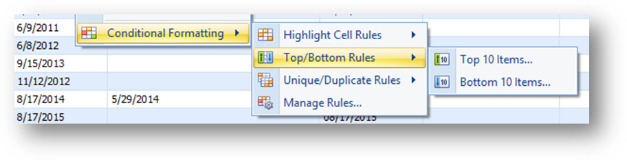
These are options for Top/Bottom Rules on a text, link, coded, or date field.
Note: On text, link, and coded fields this rule does not show the formatting.
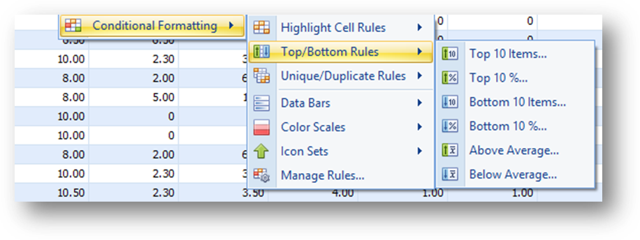
These are the options for Top/Bottom Rules on a numeric field.
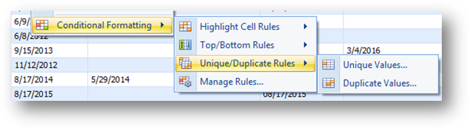
These are the options for Unique/Duplicate Rules on a text, link, coded, numeric, check box, or date field.
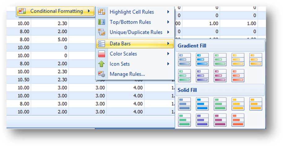
These are the options for Data Bars on a numeric field.

These are the options for Color Scales on a numeric field.
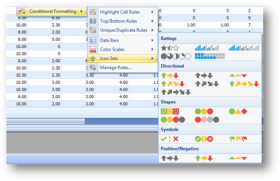
These are the options for Icon Sets on a numeric field.
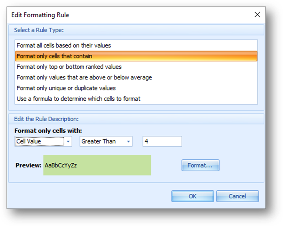
Once the rule shortcut options have been selected a formatting screen will open. The screen will vary depending on the option selected.
When Manage Rules is selected from the context menu, the rules manager screen opens.
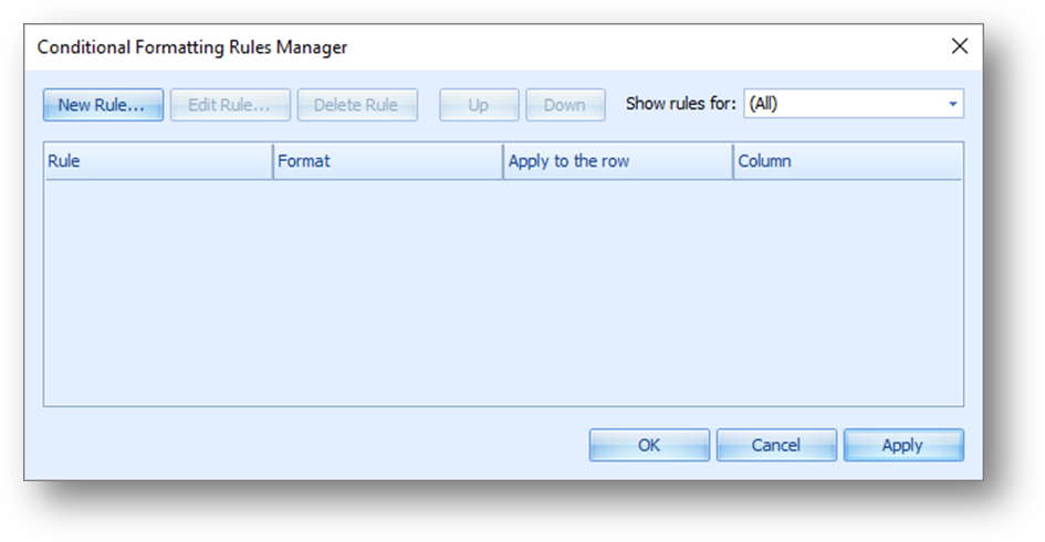
The rule manager is where all conditional formatting for that grid are saved, whether set using one of the rule shortcut options or added directly in the rule manager.
Note: After a rule is set the rules manager must be used to view or edit a rule.
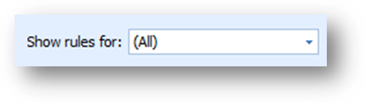
To see the rule for just one field use the drop down list in Show rules for.
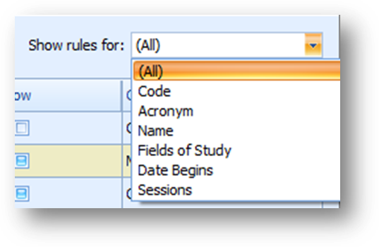
All rules for the selected field will be shown.
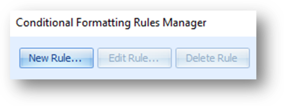
To add a new rule click New Rule.
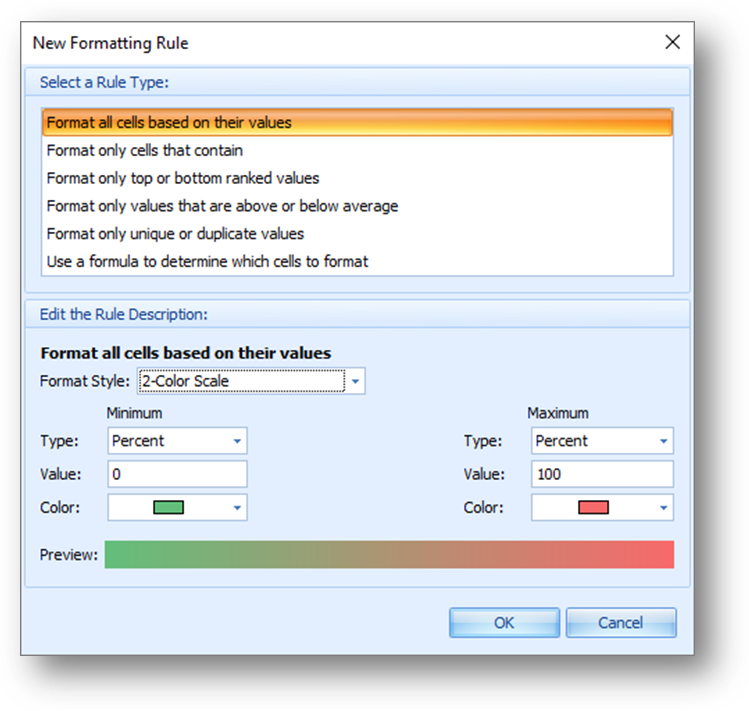
The New Formatting Rule screen will open.
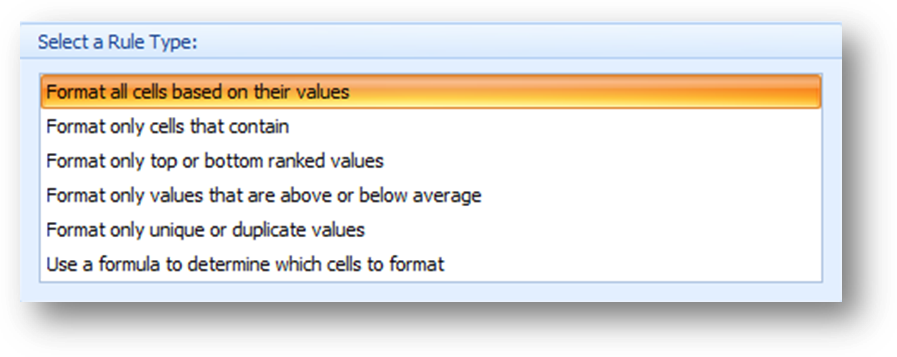
First select the rule type to use.
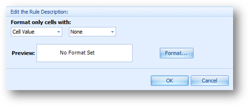
The rule description options shown below the rule types varies depending on the rule type selected.
Set the condition and formatting for the rule and click OK.
When the rule type Use a formula to determine which cells to format or Custom Condition from the Highlight Cell Rules shortcut menu is selected the Custom Condition screen opens.
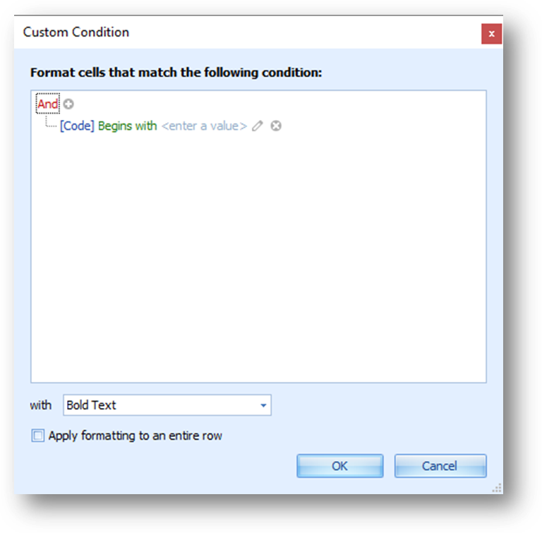
This screen allows for more complex criteria to be set for the conditional formatting on a field.
The Custom Condition screen has the same functionality as the Filter Editor described above.
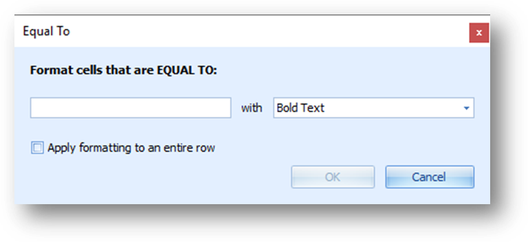
Check the Apply formatting to entire row to show the formatting on the entire row instead of just the cell.
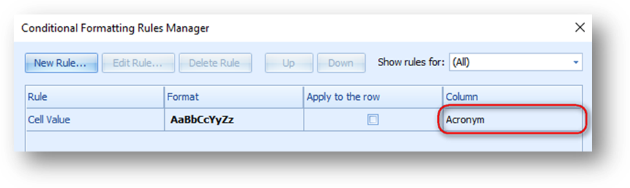
Note: By default the formatting will be show on the field launched from. Once the rule is added the field to show the formatting on can be changed in Column of the Rules Manager screen.
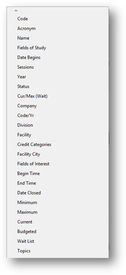
To change the field to be used in a rule, click anywhere in the Column cell of the rule and a list of available fields will open.
Select the field to be used for the rule.
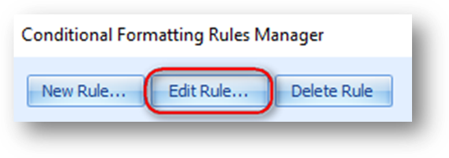
To edit an existing rule, first highlight the rule to work with, then click Edit Rule.
The Edit Formatting Rule screen will open allowing you to edit the condition and formatting.
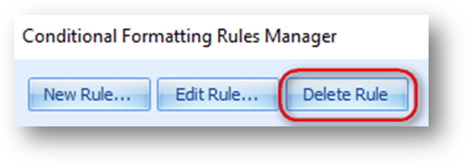
To delete an existing rule, first highlight the rule to work with, then click Delete Rule.
Rules can also be removed using Clear Rules in the context menu of the grid. Note: this option is only shown when there is at least one rule on the grid.
When you highlight Clear Rules a sub-menu of options are displayed.
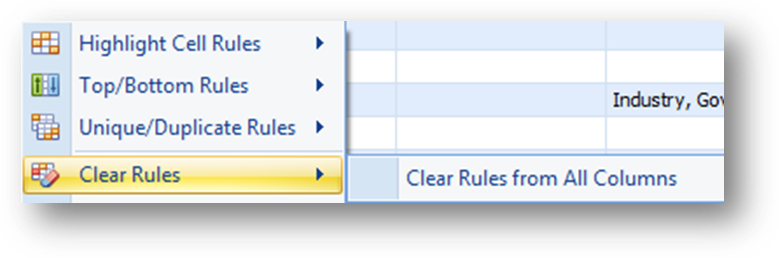
When there is at least one rule set on the grid, but none for the column launched from, there is an option to Clear Rules from All Columns.
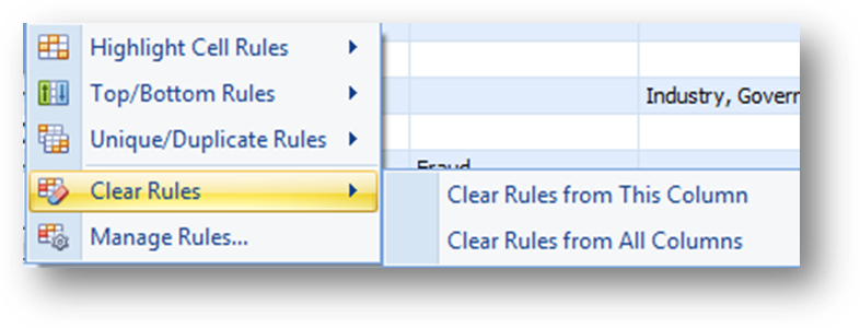
When at least one rule is set on the column launched from there are options to Clear Rules from This Columns or Clear Rules from All Columns.
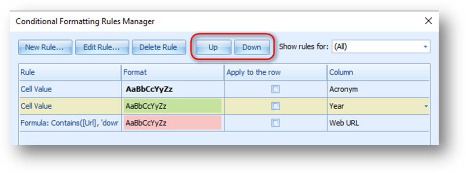
The change the order of the rules displayed, first highlight the rule to move, then click Up or Down.
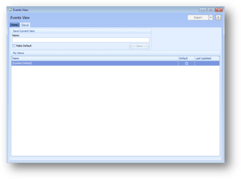
The Views tab, allows you to create a view with the current settings on the Data tab.
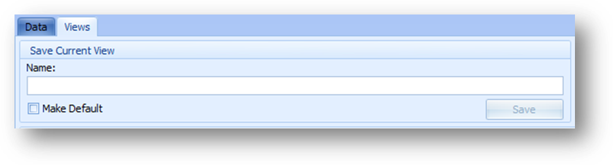
In Save Current View enter the name for the view in Name. If you want to make this your default view, check the Make Default box. Click Save to save the view.
Note: All sorting, grouping, fields shown and order set on the parent and child tabs are saved in the view. Filtering and/or conditional formatting on the parent grid is saved. Any filtering and/or conditional formatting on a child tab is not saved.
If this is an update to an already existing view, in Name enter the same name as the existing view.
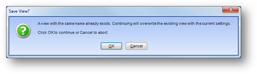
When you click Save, a message will be shown asking if you want to overwrite the existing view. Click OK to overwrite with the current settings on the Data tab.
If checked Make Default, and another existing view with a different name is already set as the default.
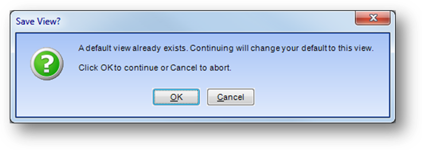
When you click Save, a message will be shown asking if you want to change the default to the new view. Click OK to change the default to this new view.
If this is an update to an already existing view, Name is the same as the existing view, that is set as the default and Make Default is not checked.
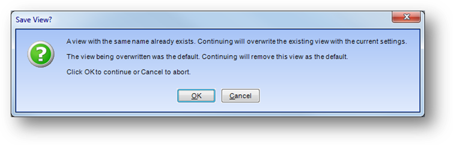
When you click Save, a message will be shown asking if you want to overwrite the existing view and remove it as the default. Click OK to overwrite and change the default setting.
If checked Make Default, and this is an update to an already existing view, Name is the same as the existing view, and another existing view with a different name is already set as the default.
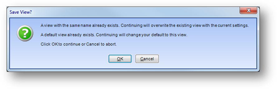
When you click Save, a message will be shown asking if you want to overwrite the existing view and make it the default. Click OK to overwrite and change the default setting.
If there are currently any filters set on any of the child tabs on the Data tab.
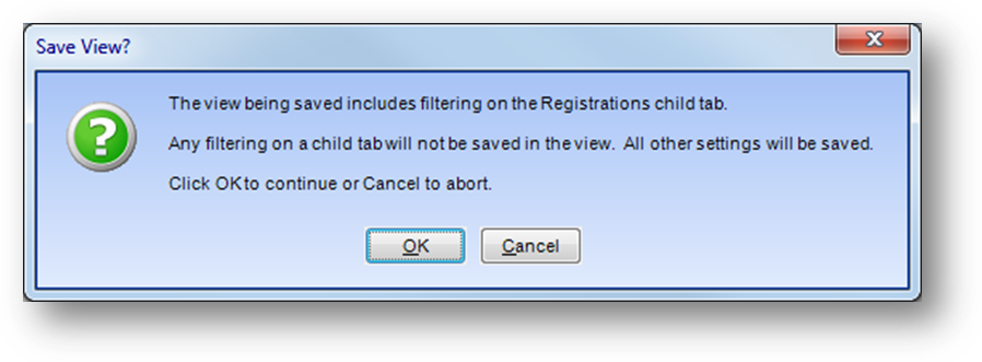
When you click Save, a message will be shown letting you know that any filtering on a child tab will not be saved in the view. All other settings, on the parent and all child tabs, will be saved. Click OK to save the view.
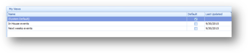
The view will then be displayed in My Views. My Views shows all the views you have created.
Note: The System Default view will be included in My Views and is always listed at the top.
If you want to set an existing view as your default view.

In the My Views grid, either check the Default box in the row for the view.
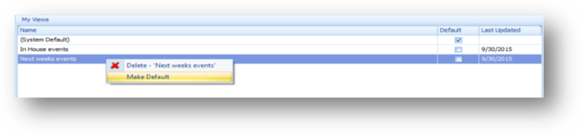
Or right-click on the row for the view and select Make Default.
If you make a view your default, when you launch event view your default view will be loaded in place of the default system view.
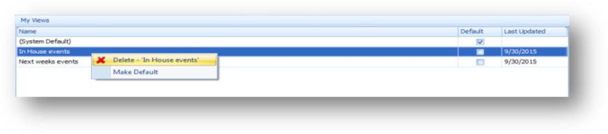
To delete a view, right-click on the row for the view in My Views and select Delete – {view name} from the context menu.
Hint: Create a base template view that can be used as a starting point for creating views. The template view should include fields that you would always want to have in a view such as Name, Code and Year. When creating a new view, select the base template view in Select View. Then set the Primary Event Date Filter, add fields to the grid, and set filters, sorting, and grouping as needed. When everything is set go to the Views tab and save the view. Repeat the process for additional view starting by loading the base template view.
Watch the Events View Getting Started video:
Watch the Events View Primary Event Date Filter video:
Watch the Events View Grid Sorting and Grouping video:
Watch the Events View Modify Fields in Grids video:
Watch the Events View Easy Filtering video:
Watch the Events View Filtering with Filter Editor video:
Watch the Events View Apply and Clear Filters video:
Watch the Events View Saving and Loading Views video: