Purpose: To view names and related data.
Launch Point: The view can be launched from the following locations(s):
•Names → Views
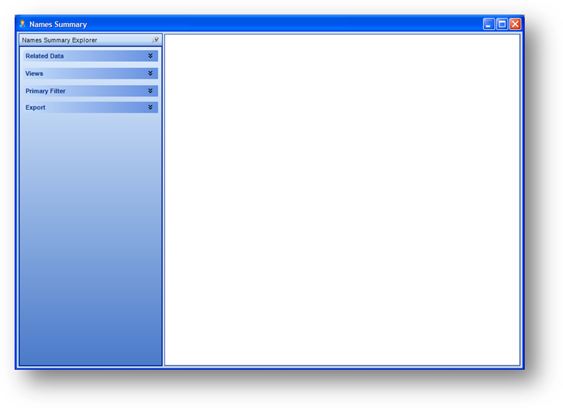
Example: When the view is launched a form will open
To enter your filter criteria, expand the Primary Filter group by clicking on the associated expansion-arrow icon.

For more extensive filtering needs, you can click the Open Selection Criteria button to launch the selection criteria window.
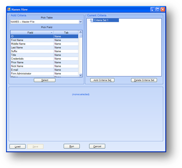
Note: When you use the selection criteria window, any data entered in the Primary Filter fields will be cleared.
The Primary Filter group on the left side of the window is used to filter the records displayed. You can enter the member status, member type, preferred chapter, actual chapter, city, county, and ethnicity. To update the records displayed, click on the Run button which once you change the filter parameters, will say Run (Re-extract data). To clear the settings in all of the filter fields click the Clear button.

The Export group on the left side of the window allows you to export the records currently displayed in the grid.
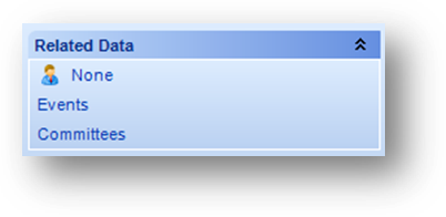
In the Related Data group on the left side of the window, you can select what type of detail row information you would like to display for the individual. By default the view has no related detail information shown. This is denoted by the icon to the left of None. An icon will be displayed to the left of the currently selected option.
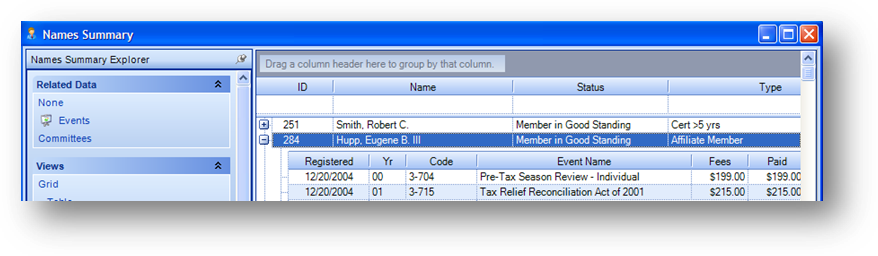
When you select to show the Events detail information by clicking the plus sign to the left of the individual’s row, the registration detail rows will be displayed.
Note: you can only view one type of related data at a time.

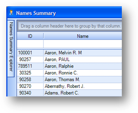
In the Grid – Table view, the top row of the grid is a filter row. This allows you to filter the display on any field in the grid. In the example above, “Member in Good Standing” was selected from the Status drop down list. This limited the records already displayed in the grid, to those which have a status of “Member in Good Standing”. You can also type text into the filter row. This will limit the records already displayed in the grid, to those which start with the text entered. To clear the display filter, click the remove filter icon in the right of the field in the filter row.

In the Grid – Table view above, the grid is a grouping area. This allows you to group the data currently displayed in the grid.

In the example above the header for the Type field was dragged into the grouping area. The data is then grouped by type in the grid. To remove the grouping, drag the field out of the grouping area.

You can drag multiple fields into the grouping area. In this example the data is first grouped by type and then sub-grouped by business - general.
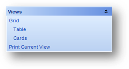
The Views group on the left side of the window allows you to change how the data is displayed. By default, the view is set to Grid - Table. To print the data currently displayed using the current view setting, click Print Current View.
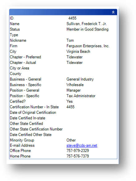
When you select the Grid – Cards view, the data for each person is in a vertical “card”.

Note: The Names Summary Explorer bar can be hidden by clicking on the push-pin icon.
When the Names Summary Explorer bar is hidden, you can display the bar by hovering over it with your mouse. To anchor the bar in the window again, hover over the hidden bar to display, and click the push-pin icon again.
When in the Grid – Table view, changes made to the grid such as moving a field, changing the width of a column, or the sort, are saved under the current login account. These settings will remain for this view and login account until the user resets to the system defaults. To go back to the system default settings for the grid, right click anywhere in the grid to open the context menu and select Reset Columns.
Watch the Names View video: