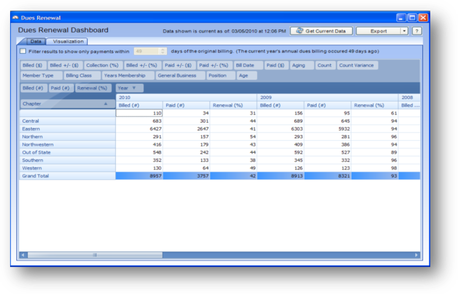
Purpose: To allow the user to view and compare various information about the last 5 years of annual dues billings.
Launch Point: This dashboard can be launched from the following location(s):
•Dues → Dashboards →
Example: When the dashboard is launched a window will open
Note: the billed data used in this dashboard represents only the original annual dues billings. Subsequent adjustments made to those original billings or additional billings on other dates are not included. Members with a zero dollar billing or no billing also are not included.
The Chapter, General Business, Member Type, Billing Class, Position, Age, and Years Membership reflect the current data on the name record. This data may have been different at the time of the billing.
The Years Membership is calculated from the current join date on the record.
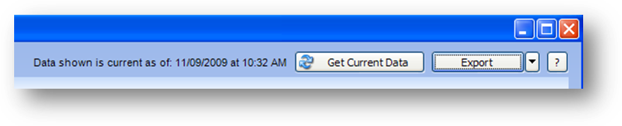
In the upper right of the window you will find three buttons, Get Current Data, Export, and Help.
The data displayed is not refreshed when you launch the dashboard. You will see text to the left of the Get Current Data button showing when the data was last retrieved. To populate the grid with current data click the Get Current Data button. Note: this process may take several minutes.
To export to excel click the down arrow on the Export button and select either Excel 2007 (.xlsx) or Excel XP/2003 (.xls) from the list.
The Help button, which has the question mark, will open documentation on the dashboard.
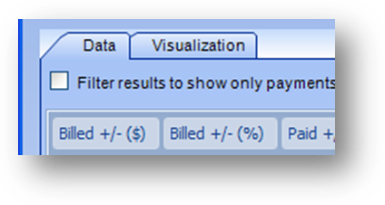
The dashboard is made up of two tabs. The Data tab is where you can manipulate and view the data in a grid. The Visualization tab will show that data in a chart or graph.
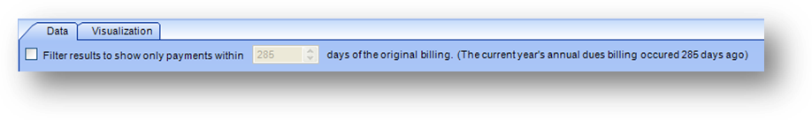
At the top of the Data tab you will see how many days it has been since the annual billing for the current dues year. By default records for everyone in the annual billing are displayed. You can filter the dashboard to show only records that have a payment within a specified number of days since the annual billing.
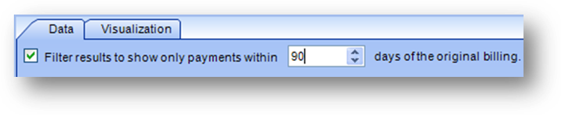
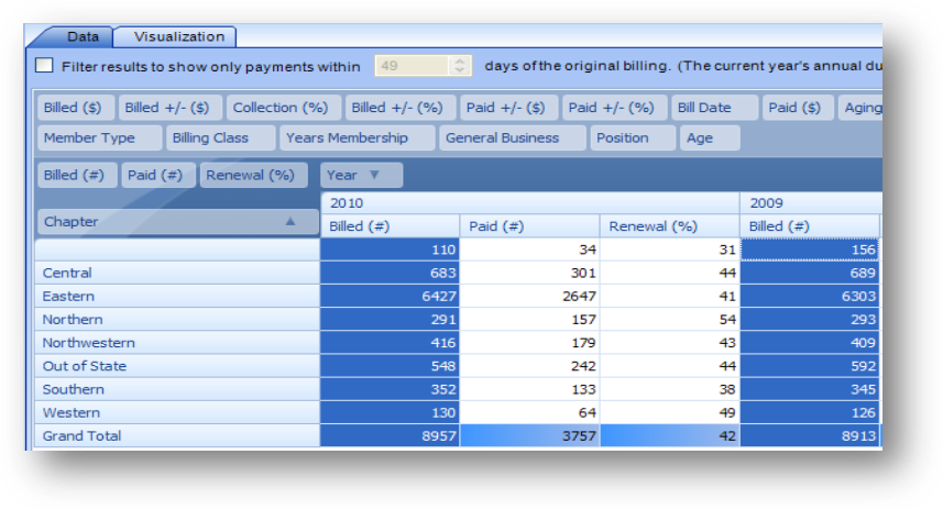
Check the box to Filter results to show only payments within XX days of the original billing and enter the number of days. In this example I set the days to 90.
Note: When you filter for payments within a specified number of days if someone has not paid their dues in the specified number of days their record is removed from Paid (#), Paid ($), Paid +/- ($), and Paid +/- (%) for any year they did not pay within the specified number of days. For example, if member A paid their 2009 dues within the specified number of days they would be included in the paid fields for the 2009 dues year. But if they did not pay their 2010 dues within the specified number of days they would be excluded from the paid fields for the 2010 dues year. When there is no filter applied the grand total for Paid (#) in 2010 is 3757 and for Paid ($) is $724,390. If you filter the results for payments made within 20 days the Paid (#) total in 2010 changes to 1191 and Paid ($) changes to $231,580.

The outlined area above is referred to as the filter header. When a filter is applied to a field the data displayed in the grid is affected. Not all fields allow filtering.

If a field can have a filter applied, when you hover your mouse pointer over the field you will see a filter icon in the upper right corner.
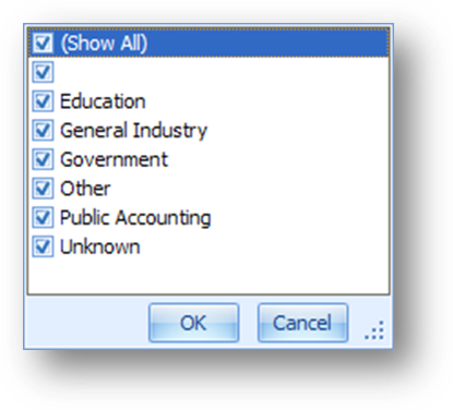
Click on the filter icon and a drop down menu will open. The list is populated with all the unique values in the field. By default, all the listings will be checked. To filter out the data for any of the listings uncheck the box.
Note: a check box with no text means that there are records with a blank in the field.

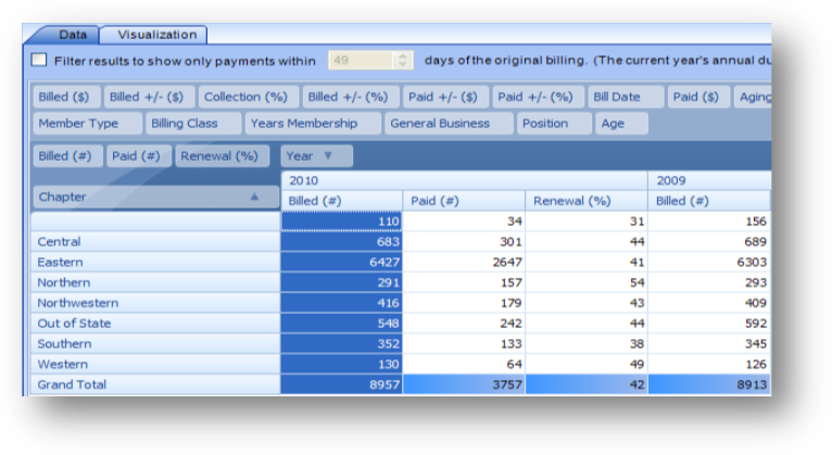
The outlined area above is referred to as the data header. The fields in this area are displayed in the grid.
To add a field to the grid, drag the field into the data header. The order of the fields in the data header controls the order of the fields in the grid.
Note: not all fields are allowed to be moved into the data header.
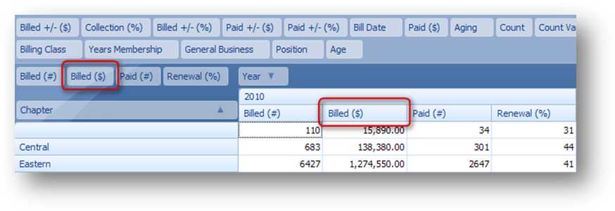
In the example above the Billed ($) field was moved from the filter header into the data header to the right of the Billed (#) field. You can see that the grid now shows the Billed ($) to the right of the Billed (#).
To remove a field from the grid, drag the field out of the data header up to the filter header.
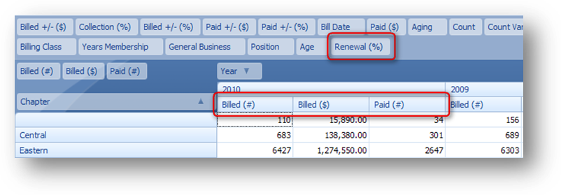
In the example above the Renewal (%) field was moved out of the data header into the filter header. You can see that the grid no longer shows the Renewal (%).

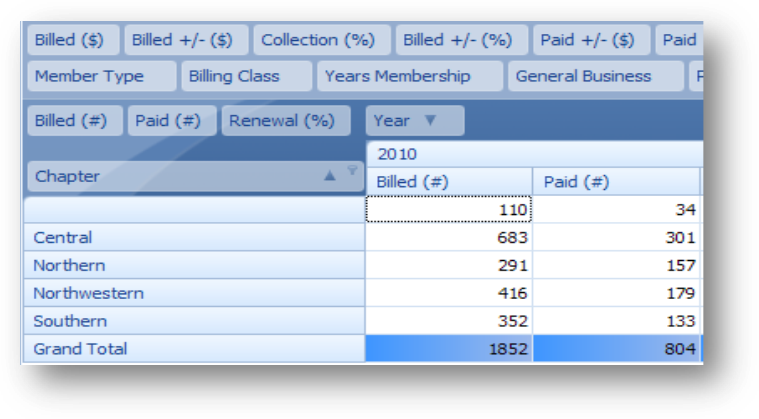
The outlined area above is referred to as the row header. The fields in this area are shown as rows in the grid.
To add a field as a row header, drag the field into the row header. The order of the fields in the row header controls their grouping.
Note: not all fields are allowed to be moved into the row header.
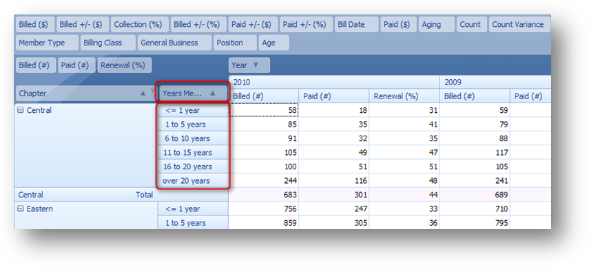
In the example above the Years Membership field was moved from the filter header into the row header to the right of the Chapter field. You can see that additional rows are now displayed in the grid as a sub group of the Chapter.
To remove a field as a row header, drag the field out of the row header up to the filter header.
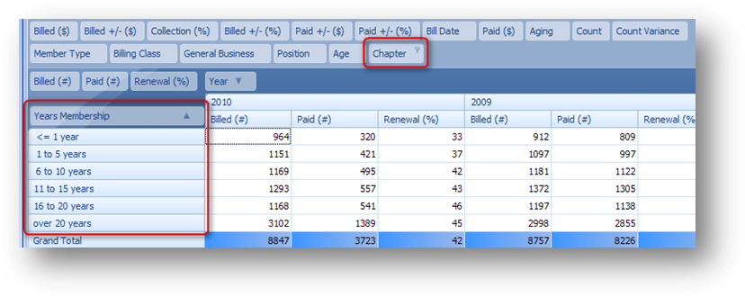
In the example above the Chapter field was moved out of the row header into the filter header. You can see that the rows associated with Chapter are no longer displayed.
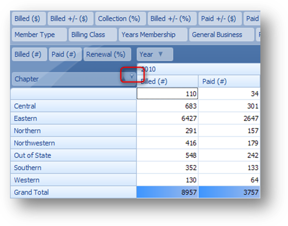
For those fields that allow filtering, you can apply a filter when the field is in the row header. If you hover your mouse pointer over the Chapter field you will see a filter icon in the upper right corner.
Click on the filter icon and a drop down menu will open. The list is populated with all the unique values in the field. By default, all the listings will be checked. To filter out the data for any of the listings uncheck the box.
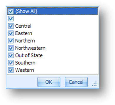
Note: a check box with no text means that there are records with a blank in the field.
Uncheck Eastern, Out of State, and Western. When you click OK the unchecked chapters will be removed from the grid.

The data can be sorted on any of the column or row header fields by clicking on the field. The arrow on the button denotes if the data is sorted in ascending or descending order.

The outlined area above is referred to as the column header. The fields in this area are shown as columns in the grid.
To add a field as a column header drag the field into the column header. The order of the fields in the column header controls their grouping.
Note: not all fields are allowed to be moved into the column header.
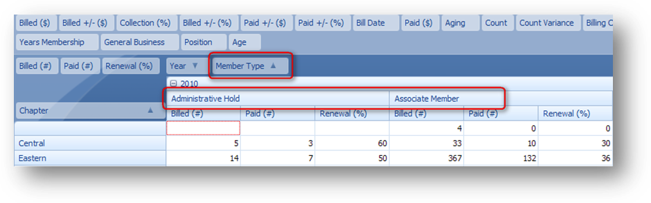
In the example above the Member Type field was moved from the filter header into the column header to the right of the Year field. You can see that additional columns are now displayed in the grid as a sub group of the Year.
To remove a field as a column header drag the field out of the column header up to the filter header.
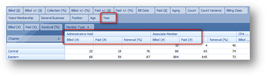
In the example above the Year field was moved out of the column header into the filter header. You can see that the columns associated with Year are no longer displayed.
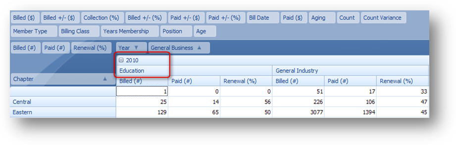
When you have more than one column header an expand/collapse icon will appear to the left of the column headers on the grid except the field at the end of the list. In the above example that is the General Business field. See the button with the ‘-‘ to the left of “2010”.
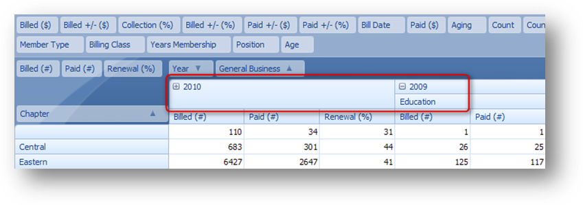
To contract the sub groups of the column heading for a specific year click on the button. Now only the totals for the year will be shown and the button will now show a ‘+’.
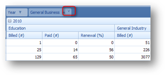
For those fields that allow filtering, you can apply a filter when the field is in the column header. If you hover over the General Business field you will see a filter icon in the upper right corner.
Click on the filter icon and a drop down menu will open. The list is populated with all the unique values in the field. By default, all the listings will be checked. To filter out the data for any of the listings uncheck the box.
Note: a check box with no text means that there are records with a blank in the field.
Uncheck General Industries and when you click OK the unchecked general business will be removed from the grid.

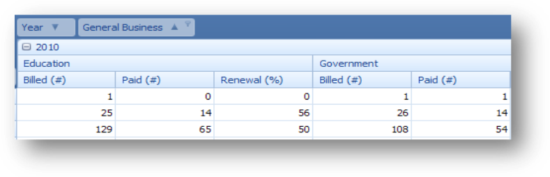
The data can be sorted on any of the column or row header fields by clicking on the field. The arrow on the button denotes if the data is sorted in ascending or descending order.

When you right-click on a field header, here the Renewal (%) field, a context menu is displayed with an option to sort the rows by that column.

When you select this option a sort icon is shown in the right of the field header. The data in the grid is also sorted by the values in that column. To remove the sort on the column, right-click on the field header to open the context menu and select the sort listing again to de-select the sorting.

When you right-click on a row header field, here the 31-60 field, a context menu is displayed with option(s) to sort the column by that row.

Open the context menu on the Central 31-60 row header and select to Sort “Year – Paid (#)” by this Row. See that the 2008 data is now shown to the left of the 2009 data because the Paid (#) amount in the Central – 31-60 for 2008 is higher than the Paid (#) amount in the Central – 31-60 for 2009.
To remove the sort, right-click on the row header field to open the context menu and select the sort listing again to de-select the sorting.

Double click on a cell in the grid to see the underlying data for that cell.
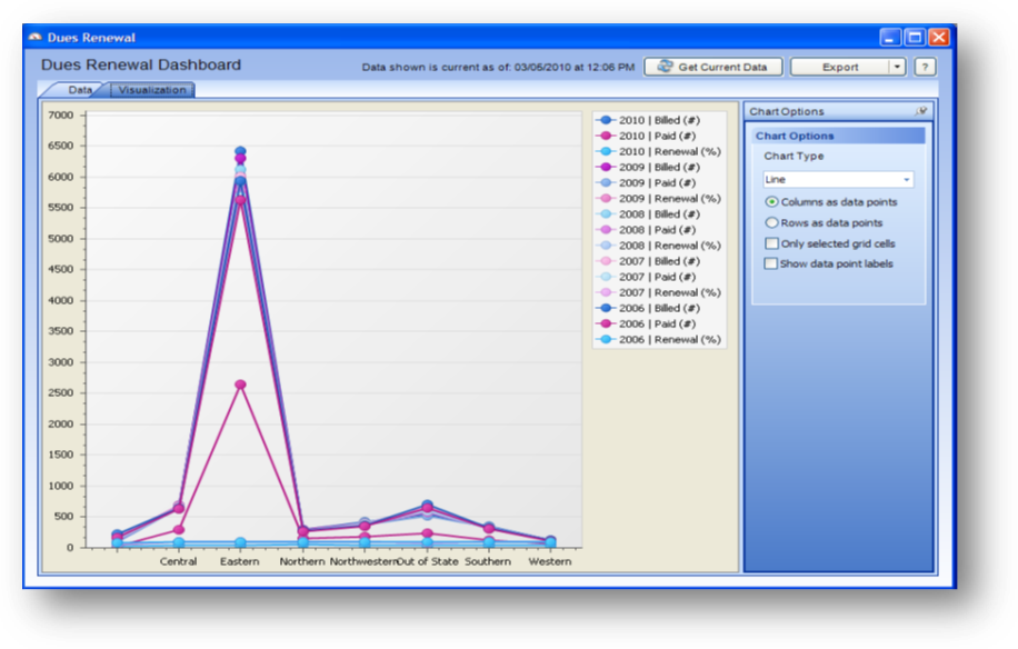
The Visualization tab displays charts and graphs of the dues information on the Data tab.
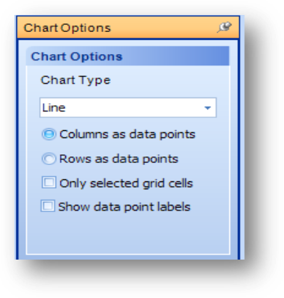
The Chart Options on the right of the window allow you to change how the data is displayed. The Chart Type options are Line, Line 3D, Bar, Bar 3D, Pie, Pie 3D, and Manhattan Bar.
You can select either to show the Columns as data points or Rows as data points.
If you check the box for Only selected grid cells then you must highlight the grid cells on the Data tab that you want represented in the chart. When the box is unchecked then all data from the grid is represented.
When the Show data point labels is checked the values for the data points are displayed on the grid/chart.
Highlight the cells in the 2010 Billed (#) column.
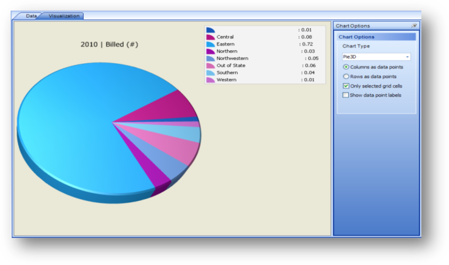
On the Visualization tab select the Chart Type of Pie 3D and check the Only selected grid cells box. On the Data tab the Chapter field is a row header and the Year field is a column header. The Columns as data points is selected so this chart displays the selected year’s data broken down by chapter.
Note: If you hold down your left mouse button while the pointer is on the pie chart you can drag your mouse to change the orientation of the pie chart.
Go back to the Data tab and select additional cells from the 2009 Billed (#) column.
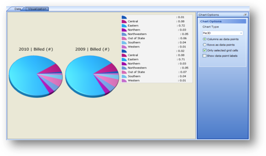
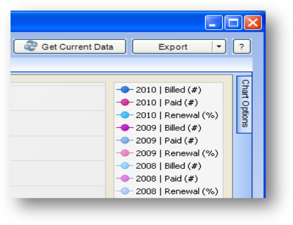
On the Visualization tab there are now two pie charts. One for each column of data that is highlighted on the Data tab.
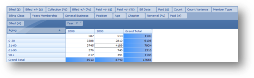
On the Data tab Aging is in the row header and Year is in the column header. The Year field is filtered to only show 2009 and 2008 information. In the data header Billed (#) is the only field. Do not highlight any of the cells in the grid.
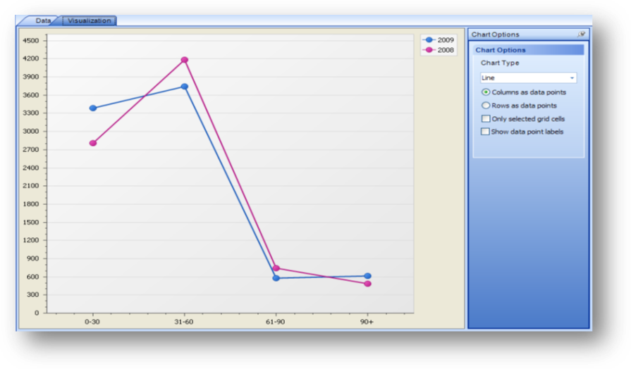
On the Visualization tab select the Chart Type of Line and make sure the Only selected grid cells box is unchecked. The Columns as data points is selected so this chart displays all the information shown on the Data tab broken down by aging time frames.
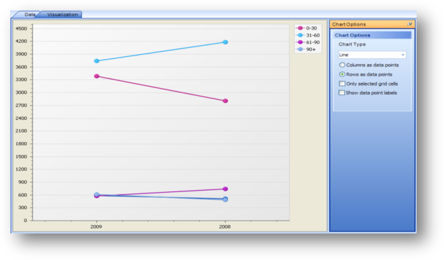
Change to Rows as data points and the chart displays all the information shown on the Data tab broken down by year.
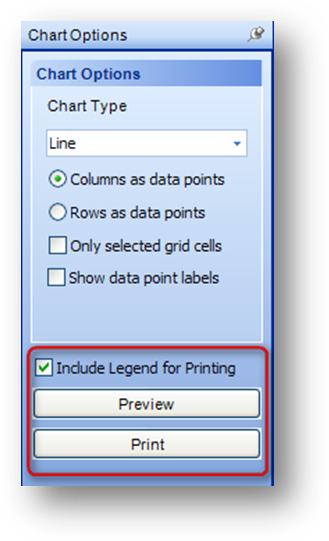
The chart can be previewed or printed by selecting the appropriate button on the Chart Options bar. When the chart is previewed or printed it will include the legend by default. To exclude the legend un-check the Include Legend for Printing box.
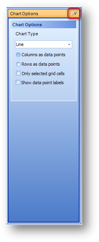
Note: The Chart Options bar can be hidden by clicking on the push-pin icon.
When the Chart Options bar is hidden, you can display the bar by hovering over it with your mouse. To anchor the bar in the window again, hover over the hidden bar to display, and click the push-pin icon again.