Purpose: To allow the user to view and compare information for this year's budgeted registration count, this year's current registration count, last year's registration count, this year's budgeted revenue, this year's current revenu, and last year's revenue.
Launch Point: This dashboard can be launched from the following location(s):
•Events à Dashboards à
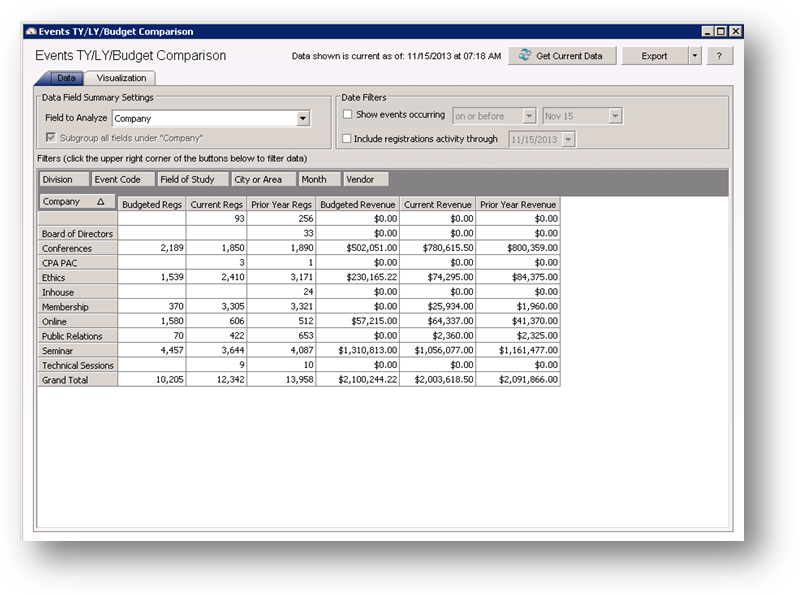
Example: When the dashboard is launched a window will open
Note: the data used in this dashboard represents information at the time the data was last extracted.
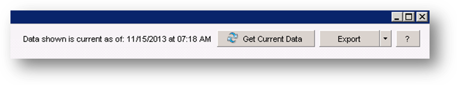
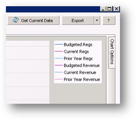
In the upper right of the window you will find three buttons, Get Current Data, Export, and Help.
The data displayed is not refreshed when you launch the dashboard. You will see text to the left of the Get Current Data button showing when the data was last retrieved. To populate the grid with current data click the Get Current Data button. Note: this process may take several minutes. The text to the left of the Get Current Data button will be shown in red when the last extract was not done on the current date.
To export to excel click the down arrow on the Export button and select either Excel 2007 (.xlsx) or Excel 2000/2002/XP/2003 (.xls) from the list.
The Help button, which has the question mark, will open documentation on the dashboard.
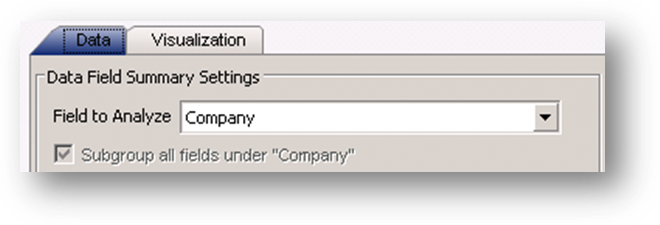
The dashboard is made up of two tabs. The Data tab is where you can manipulate and view the data in a grid. The Visualization tab will show that data in a chart or graph.
At the top left of the Data tab are the Data Field Summary Settings. These control the fields and data displayed in the grid.
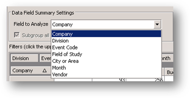
The Field to Analyze options control the rows displayed in the grid. Click the down arrow to see the options for Field to Analyze.
Company: The current company assigned to the event on the Events file maintenance Name tab.
Division: The current division assigned to the event on the Events file maintenance Name tab.
Event Code: The unique code assigned to the event on the Events file maintenance Name tab. Note: some associations have a parameter set on their system so this field is labeled Acronym.
Field of Study: The current field of study assigned to the event on the Events file maintenance Name tab.
Note: If the event has multiple fields of study, only one is used to determine under which field of study the data for the event will be displayed in the dashboard. The dashboard references the first code in the field.
This may not be the field of study seen at the top of the list on the Events file maintenance Name tab. The listings there are sorted alphabetically and do not represent the order in which the data is actually stored in the database.
City or Area: The current city or area assigned to the event on the Events file maintenance Name tab.
Month: The months in your association’s fiscal year. The number to the left of the month is the accounting period assigned to that month in the accounting calendar.
Vendor: The current vendor assigned to the event on the Events file maintenance Data tab. Note: If the event has multople vendors assigned, only the vendor 1 is used to determine under which vendor the data for the event will be displayed in the dashboard.
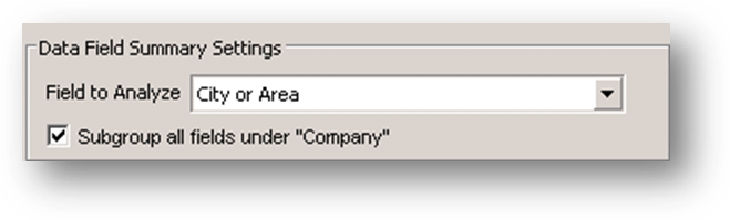
The Subgroup all fields under “Company” check box allows for the data displayed in the grid to be subgrouped by Company. Click the box to add Company to the left of the field to analyze. Note: if company is selected as the field to analyze the Subgroup all fields under “Company” check box will be disabled.
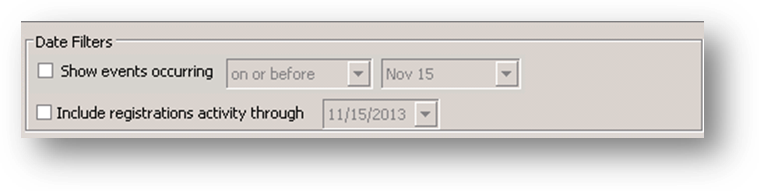
At the top right of the Data tab is the Date Filters settings. By default all data current as of the last time the Get Current Data button was used is displayed. You can filter the dashboard to show only information for events within a specified date range by checking the Show events occuring check box.
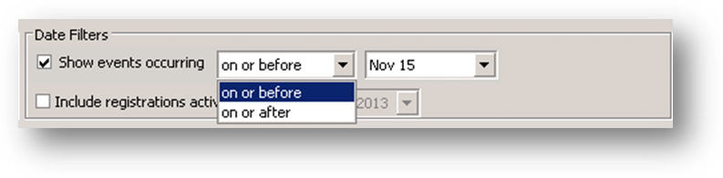
To filter the data displayed check the Show events occurring box. Click the down arrow on the first field to see the comparison options. Choose either on or before or on or after.

In the second field enter the month and day. Note: if you use the drop down and select the date from the calendar the year is irrelevant.
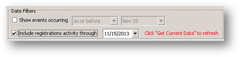
To see only information for registrations through a specified date check the Include registrations activity through check box. Note: when checked a message to “Click ‘Get Current Data’ to refresh” is shown. This is because when using this filter you must pull the current data again.
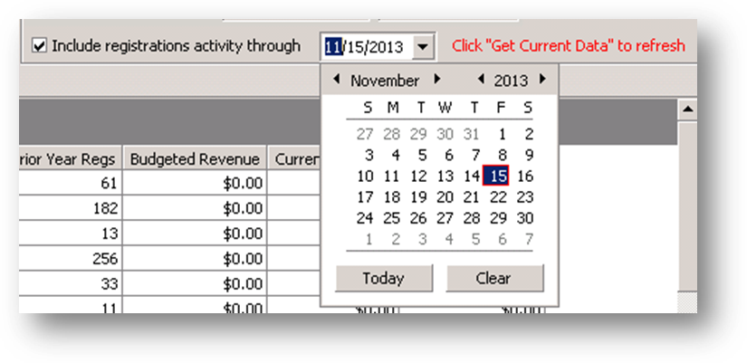
In the date field enter the date.

The outlined area above is referred to as the filter header. When a filter is applied to a field the data displayed in the grid is affected.
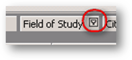
When you hover your mouse pointer over the field you will see a filter icon in the upper right corner.
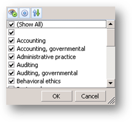
Click on the filter icon and a drop down menu will open. The list is populated with all the unique values in the field. By default all the listings will be checked. To filter out the data for any of the listings uncheck the box.
Note: a check box with no text means that there are records with a blank in the field.

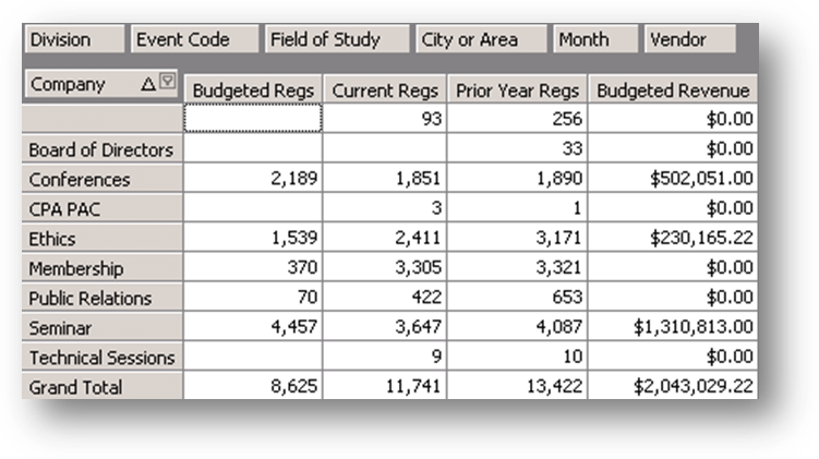
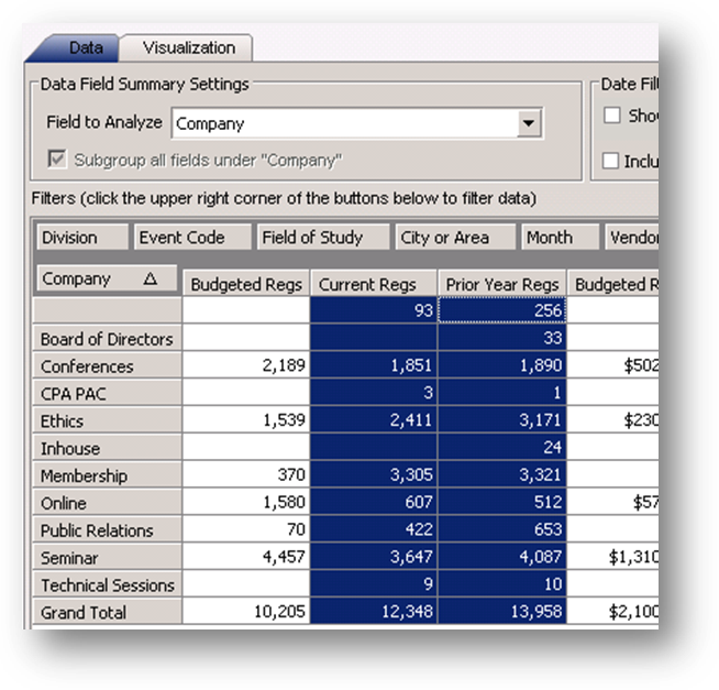
The outlined area above is referred to as the row header. The fields in this area are shown as rows in the grid. The field displayed in the row header is controlled by the setting in Field to Analyze.
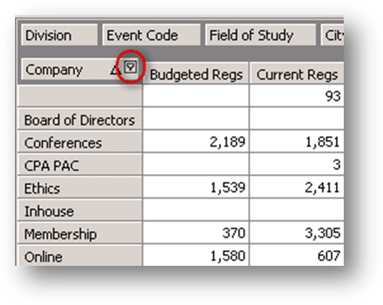
You can apply a filter when the field is in the row header. If you hover your mouse pointer over the Company field you will see a filter icon in the upper right corner.
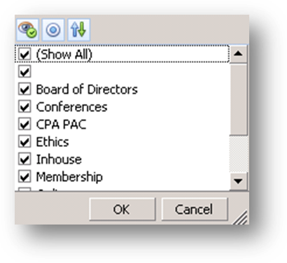
Click on the filter icon and a drop down menu will open. The list is populated with all the unique values in the field. By default all the listings will be checked. To filter out the data for any of the listings uncheck the box.
Note: a check box with no text means that there are records with a blank in the field.
Uncheck Inhouse, and Online. When you click OK the unchecked companies will be removed from the grid.

The data can be sorted on the row header field by clicking on
the field. The arrow on the button denotes if the data is sorted in ascending or
descending order.

When you right click on a field header, here the Current Regs field, a context menu is displayed with an option to sort the rows by that column.
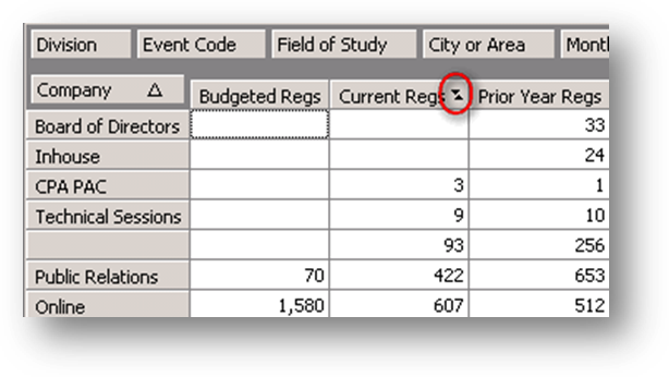
When you select this option a sort icon is shown in the right of the field header. The data in the grid is also sorted by the values in that column. To remove the sort on the column, right click on the field header to open the context menu and select the sort listing again to de-select the sorting or select Remove All Sorting.
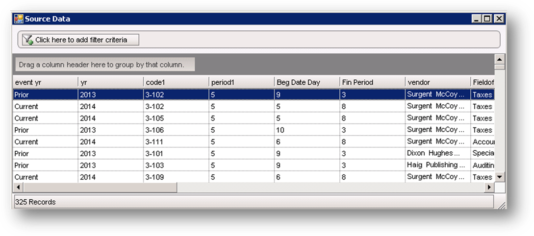
Double click on a cell in the grid to see the underlying data for that cell.
The Visualization tab displays charts and graphs of the event information on the Data tab.
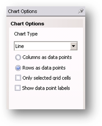
The Chart Options on the right of the window allow you to change how the data is displayed. The Chart Type options are Line, Line 3D, Bar, Bar 3D, Pie, Pie 3D, and Manhattan Bar.
You can select either to show the Columns as data points or Rows as data points.
If you check the box for Only selected grid cells then you must highlight the grid cells on the Data tab that you want represented in the chart. When the box is unchecked then all data from the grid is represented.
When the Show data point labels is checked the values for the data points are displayed on the grid/chart.

Highlight the cells in the Current Regs column.
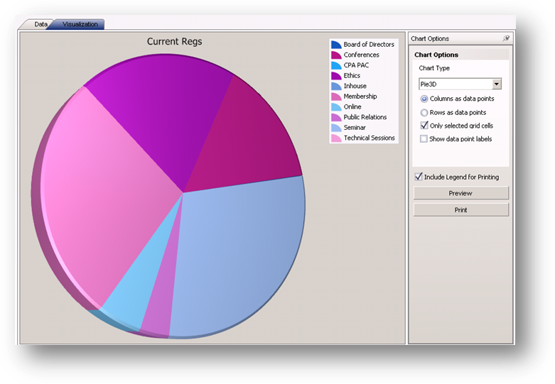
On the Visualization tab select the Chart Type of Pie 3D and check the Only selected grid cells box. On the Data tab the Company field is a row header and the Current Regs field is a column header. The Columns as data points is selected so this chart displays the current regs data broken down by company.
Go back to the Data tab and select additional cells from the Prior Year Regs column.
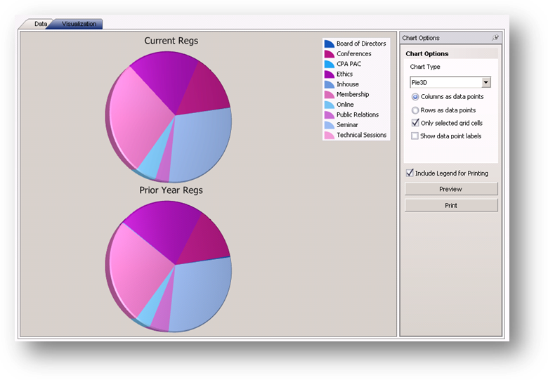
On the Visualization tab there are now two pie charts. One for each column of data that is highlighted on the Data tab.

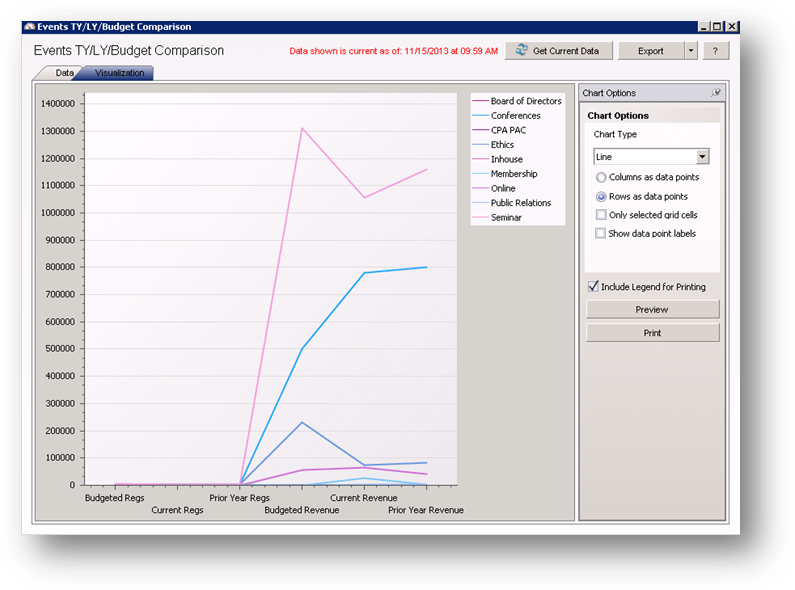
On the Data tab Company is in the row header. The Company field is filtered to only show Conferences and Seminar information. Do not highlight any of the cells in the grid.
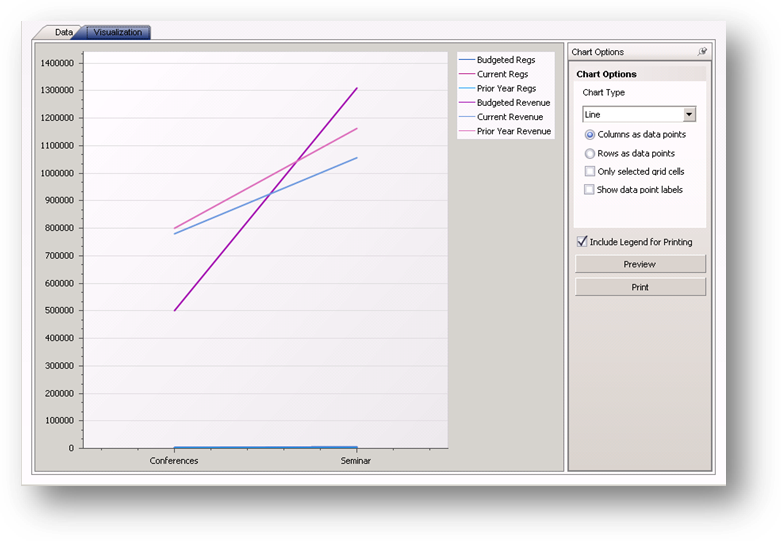
On the Visualization tab select the Chart Type of Line and make sure the Only selected grid cells box is unchecked. The Columns as data points is selected so this chart displays all the information shown on the Data tab broken down by company.
Change to Rows as data points and the chart displays all the information shown on the Data tab broken down by year.
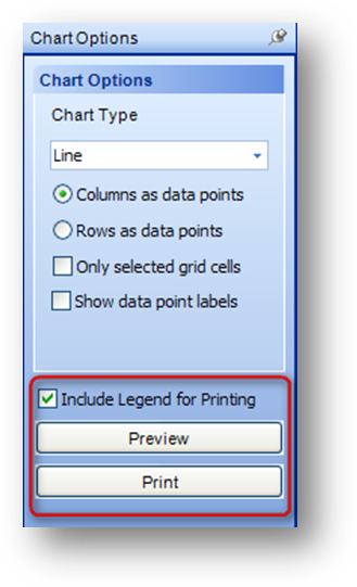
The chart can be previewed or printed by selecting the appropriate button on the Chart Options bar. When the chart is previewed or printed it will include the legend by default. To exclude the legend un-check the Include Legend for Printing box.
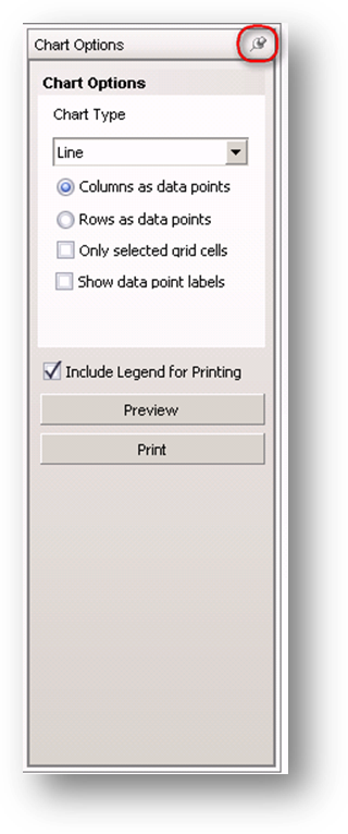
Note: The Chart Options bar can be hidden by clicking on the push-pin icon.
When the Chart Options bar is hidden, you can display the bar by hovering over it with your mouse. To anchor the bar in the window again, hover over the hidden bar to display, and click the push-pin icon again.