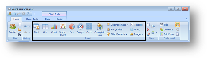
There are three different kinds of items that you can place on a dashboard canvas: data visualizations filter elements, and item groups. Click the item on the Home ribbon that you want to add to the dashboard canvas.
After you create an item, you can make an exact copy of it by right-clicking on the item and selecting Duplicate.
If you change your mind about what kind of visualization would work best with the data, you can right-click on the item and select Convert to change it into any other type of visualization item. The designer will preserve as much of your data choices as possible.
Data Visualizations
Data visualizations use charts, tables, and other graphics to display data within the Dashboard. Supplementing the dynamic data visualizations are the Image and Text Box items, which display static images or text in the dashboard design.
The data visualizations options are:
•Chart
•Grid
•Gauges
•Cards
•Pivot Table
•Pie Charts
•Scatter Chart
•Range Filter (which functions like a chart that can also filter other visualizations)
•Maps (only US and World maps are built-in; state maps must be imported as shape files)
o Choropleth Map (also called a heat map)
o Geo Point Map
o Bubble Map
o Pie Map (a pie chart for each geographic region)
Filter Elements
Filter elements are used to apply filtering to other dashboard items. There are three types of filter elements: combo box (for one-at-a-time value filtering), list box (for multi-select filtering), and tree view (for hierarchical value filtering).
Dashboard Item Groups
Dashboard item groups arrange dashboard items and allow you to manage the interaction between dashboard items within the group and outside it. Filtering that happens inside one group will not affect another group. To put an item into a group, first create the group and the visualization item separately, and then drag the visualization item into the group.